Project - FeastPass
The Problem Space
Who are we?
The FeastPass company is looking to solidify their identity and revamp the logo that they currently have. They are looking to better connect with their audience by standing out and being memorable while also being able to use these designs in a corporate setting.
We are looking for real user centric designs that we could use in our branding as well as general branding knowledge. The right candidate would work to create consistent promotional branding and come up with possible new names for the company.
Researching the brand identity.
Logo and name proposals that reflect who we are
Work to create a branding guide for us to reference
Help create prototypes using software tools that can be implemented in our marketing
Research the competitors to see what they are doing.
Creating custom branding sheets with colors and logos.
How Might We:
"How might we notify the users of the deals we are having with our local vendor partners"
"How might we entice the users to pay for a membership and to use our loyalty brand partnership"
Goals
Our main goal is to solve the problem of how we might attract members to use the app to go to local events and shop with associated vendors.
In order to get an understanding of what features other apps have that attract user engagement, we looked at some of the apps that were designed for the following purposes:
To either support local businesses or to
Provide discounts and local deals,
( these are the top 2 features our stakeholders value)
Discovery
In this discovery phase, we compiled a great deal of information and data form the top competitors of similar app platform ideas. We did this in order to create a competitor analysis and then we went to work on creating a questionnaire to interview users.
There were 6 potential customers that were interviewed with a 20-30 minute questionnaire about their experiences with food, local businesses, rewards, ect.
During this discovery, I was able to determine the pain points, attractions, and other needs from these potential customers for possible solutions.
Quotes from our users
" If I'm paying for a subscription, it wouldn't be worth it unless the vendors are close by and not too far"
" I'm always attracted to trying something new"
"I used to use punch cards, but not I don't so much because either they are offered or I always lose the physical cards"
"I go to my favorite coffee shop in my neighborhood only when I am treating myself because it is so expensive"
Step 1: Competitor Analysis
Step 2: Initial Questionnaire (Check these initial questions out with potential users)
Step 3: Affinity Mapping
User Interviews
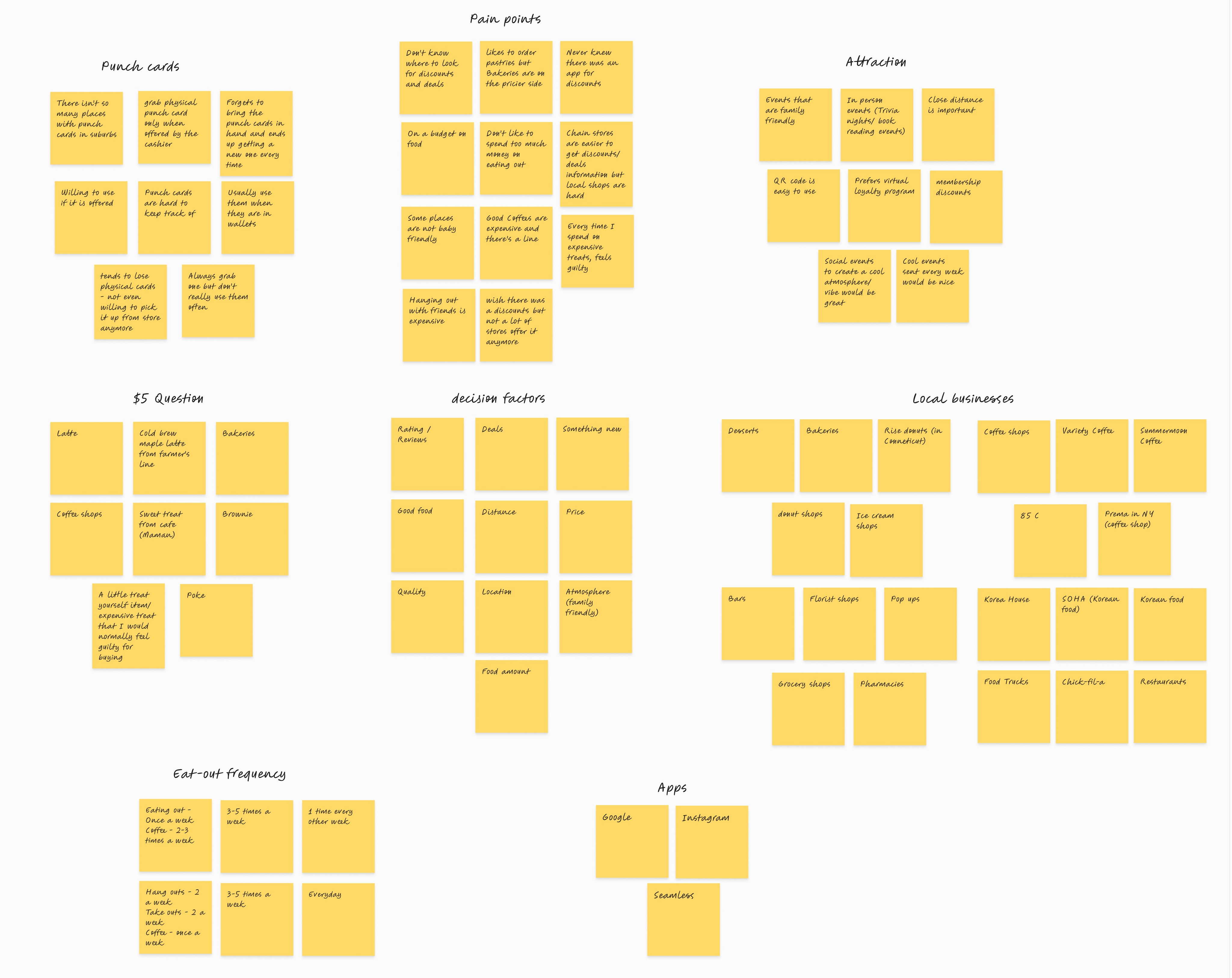
Affinity Mapping After Synthesis
Using the affinity mapping method,
We were able to discover the HMW questions and possible solutions to those. This gave us specific information to create user flows.
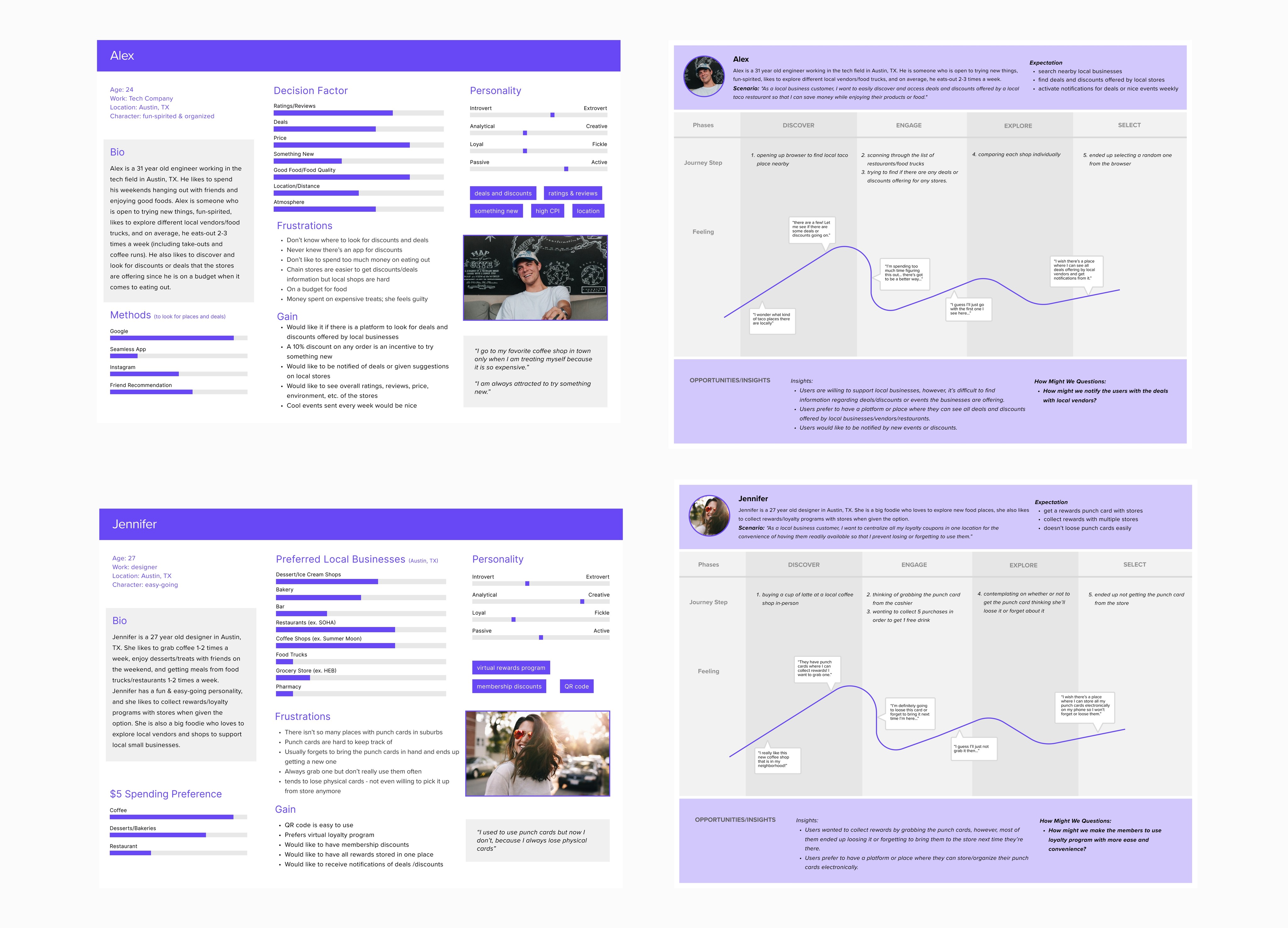
Personas & User Flows
User Story
"As a customer who wants to support local business, I want to easily discover and access deals and discounts offered by local vendors so that I can save money while enjoying their product as well."
"As a customer who wants to support local business, I want to have all my loyalty coupons centralized in one location for easy access digitally to prevent myself from losing them or forgetting where I put them."
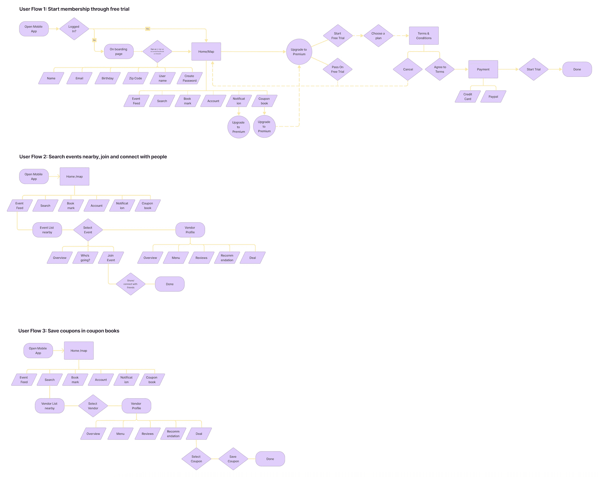
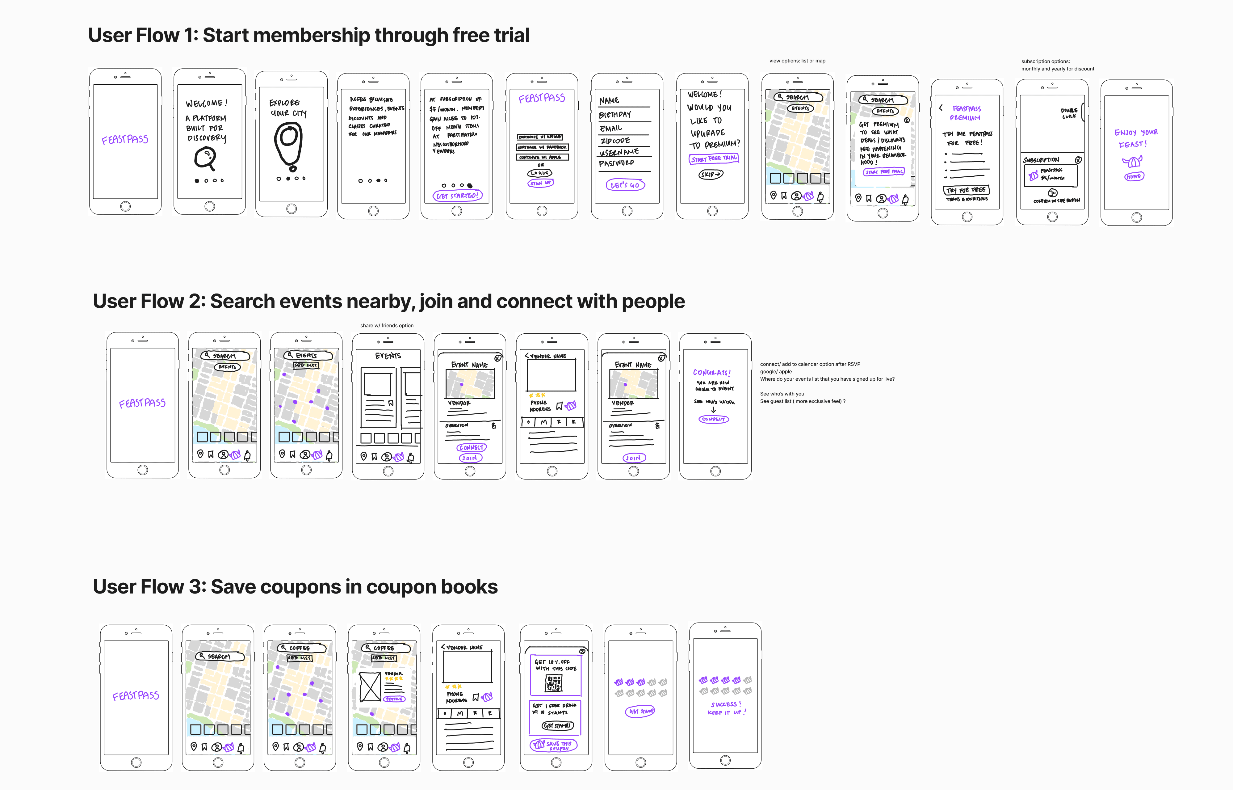
After our interviewing process, we were able to quickly define the red routes, which we turned into these user flows.
Ideate
After getting a better understanding of how the user discovers local events and discounts while supporting their local businesses, it was time to start exploring some design solutions. I was working on the visual and UX simultaneously; nailing down a new, elevated design direction, and figuring out how to implement new additional features.
Based on my research, there were a few areas I found were key:
· Increase user engagement to increase foot traffic with partnered local businesses
· Create easy and accessible user friendly activation code, so users no longer need to search for their loyalty and discount cards.
· Focus on ease of use, transparency, communication, and supporting content so users can find their way around the app to search for events, connect with friends and get discounts benefits.
· Expand content surround our brand and our partnered businesses with categorized reviews and information to build brand loyalty.
· Use retro colors in combination with clean design aesthetics to make our brand versatile and easily compatible with local businesses.
Wireframing
Initial hand sketches helped to get an idea of exactly how these user flows would look in screen form and determine what additional screens and categories were needed.
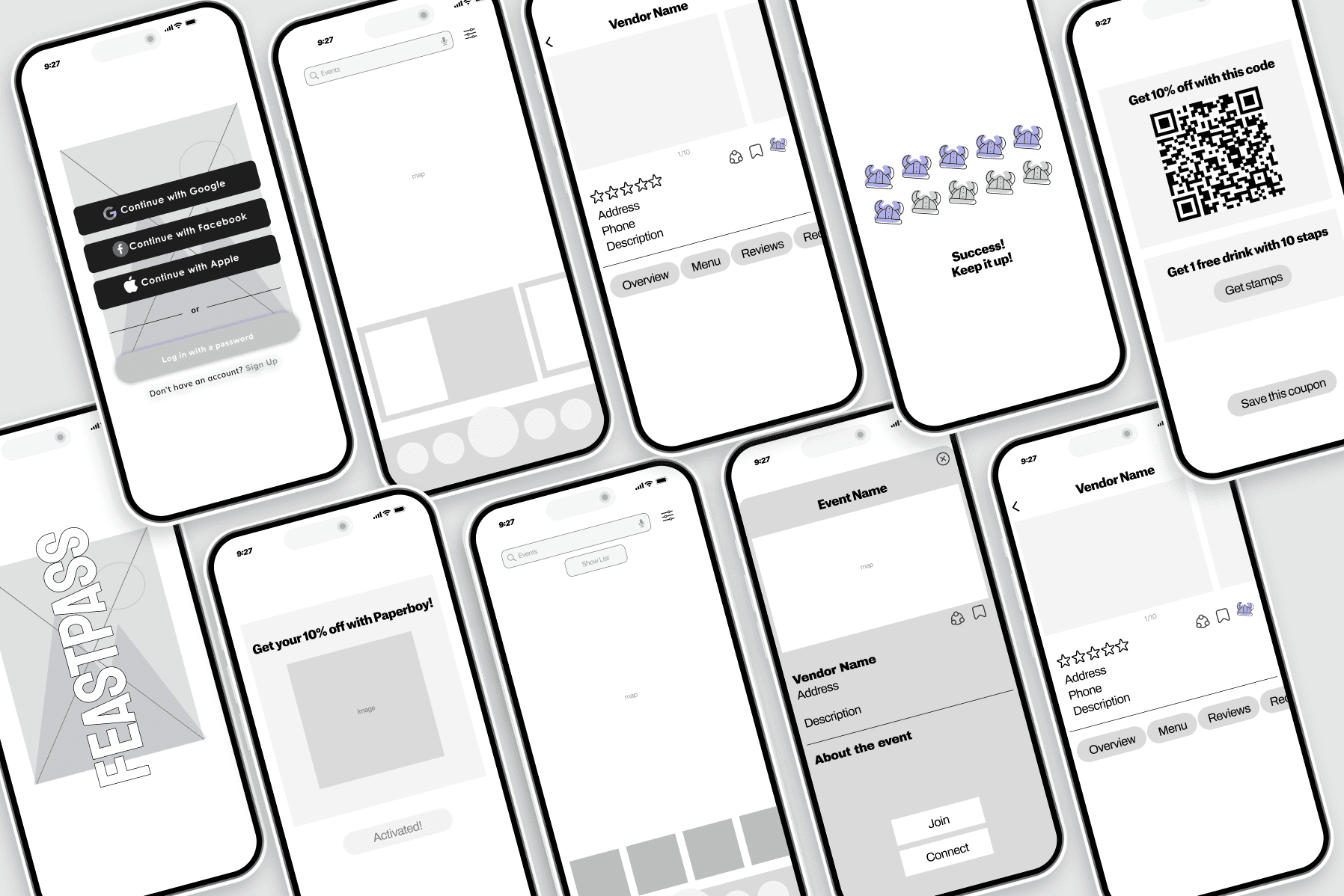
After the initial sketches, we started to build the low-fidelity screens for easy transition into hi-fidelity. We didn't do too many of these due to timing restraints, but this allowed us to review with stakeholders and team to determine any basic design changes.
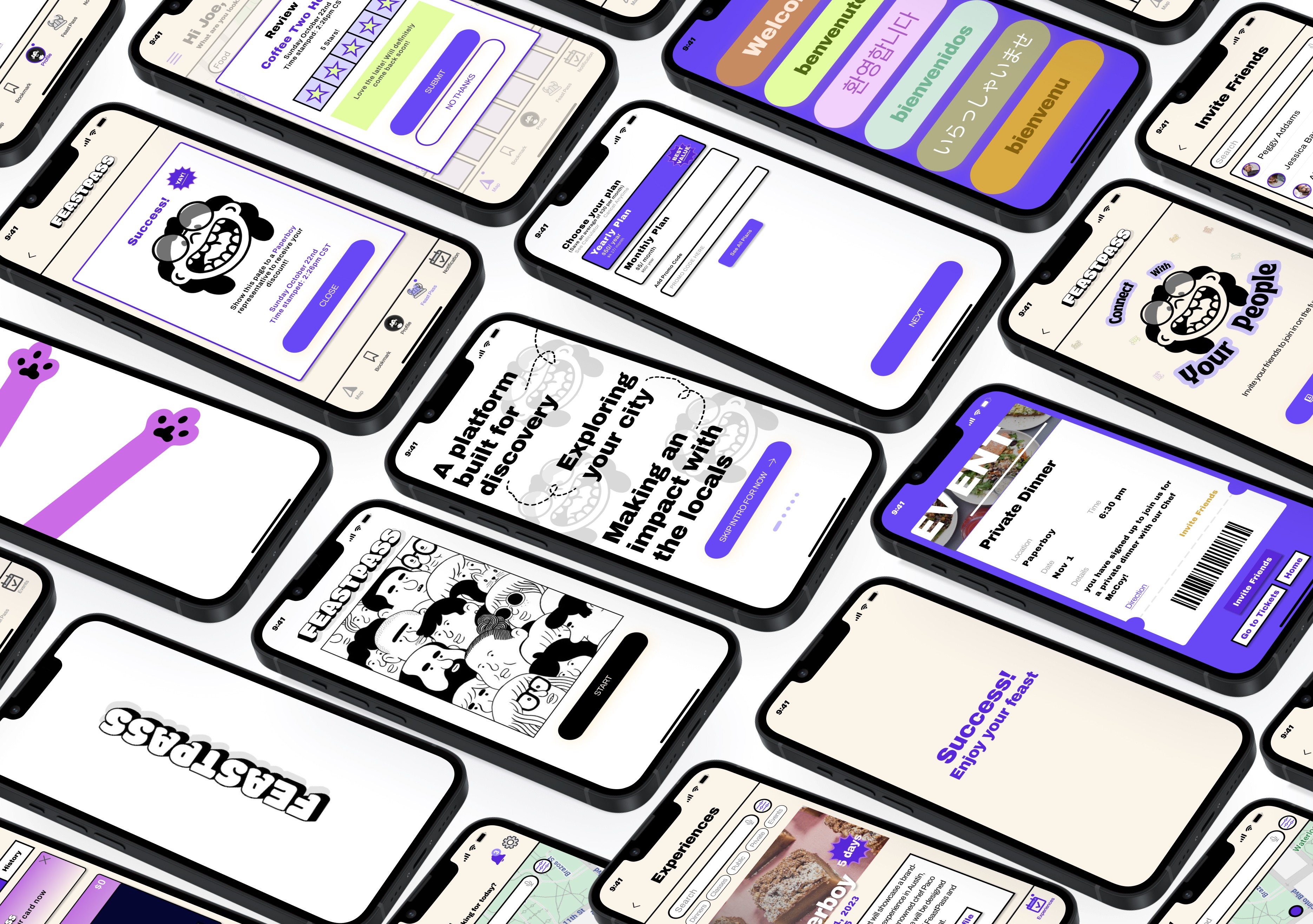
Designing the hi-fidelity screens really allowed for great usability testing on the prototype to receive feedback from users on functionality ease.
With the hi-fidelity, we were able to confirm that the intro screen felt like too much information before getting into the actual sign up of the app. Therefore, we were able to consolidate those screens for a shorter and easier intro to signing up.
Design
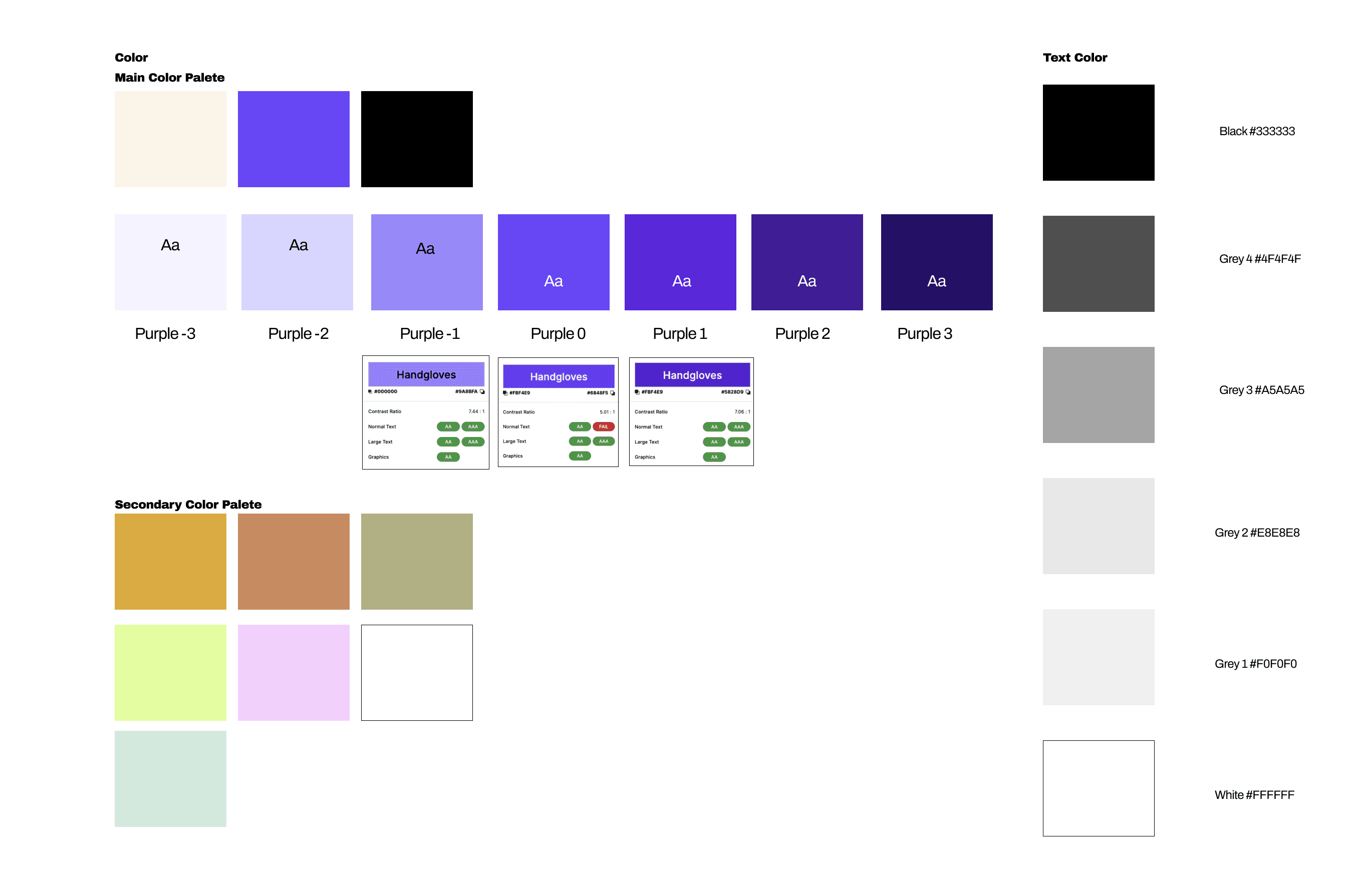
With the help of the company founders, we had a good start from a design perspective on color, aesthetics, and typography.
Using these initial tools, we were able to really narrow it down and come together as a team to elevate the design level.
" Cool, yet familiar "
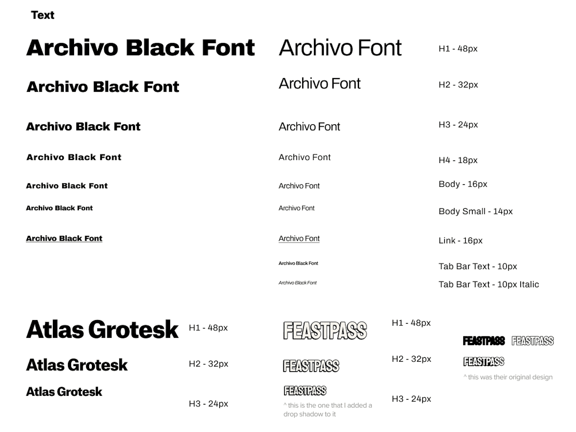
Typography
Color Palette
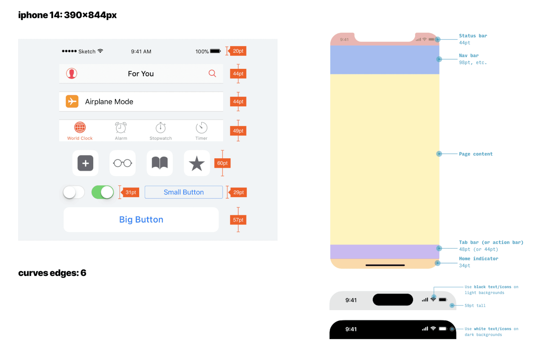
Design System
Usability Testing
We interviewed a total of 7 users for our usability testing. I prioritized the findings this prototype test for ideation and redesign.
We were able to utilize this feedback and make some great improvements on the app and determine priorities to update based on a priority chart discussed amongst designers and founders. You can run through our final prototype below.
Usability Testing Report Results and Priority Chart (Click to see the results)
The Solution
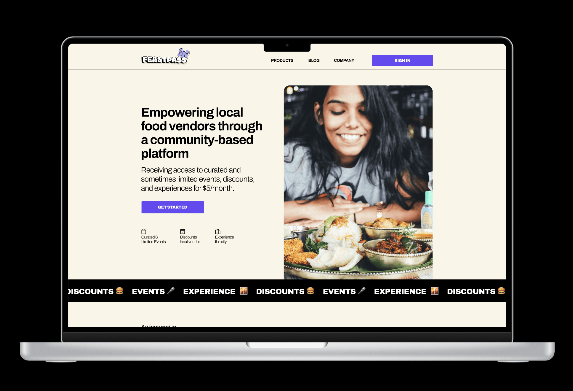
We created a seamless prototype for this new app launch that gives users that connection to the local community.
With that sense of community, through belonging to a membership, they receive exclusives and discounts on great partnered businesses.
They can search for nearby events, share and connect with friends, and be out in the community more all from being a member!

Red Routes
Flow 1: Sign up for your membership
Through the membership sign up, the user will be able to see what the perks of signing up are before signing up.
The user will also be able to choose from multiple sign up payment options.
Flow 2: Activate your FeastPass code at the local vendor for your discount
The users can easily get to the FeastPass icon on the navigation menu at the bottom to quickly type in their activation code for their discount. After a few minutes, the user will be prompted to review the vendor and experience they just visited.
Flow 3: Browse for local events, get a ticket, and share with a friend
With the unique map feature, users are able to browse for local vendors near them based on location. Then, they have the option for a map or list view. They can search for local events and get tickets through vendor profiles.
Having the ability to share the event or experience that the user is going to with their friend is a unique added features. This makes it easy to spread the word amongst locals.
Additional Features
Profile settings with options to see your saved items, reviews, experiences, and rewards.
Account settings with the unique option to change the app appearance to your choosing.
Results
I am happy to say that this membership app and website will be launching this year starting in Austin, Texas.
We we able to improve the flow for the user to create a more seamless experience and give the user more reasons to want to pay for our app in order to connect with the local community while receiving discounts.
If I had more time to work with this app, I would update some of the small things found during the interviewing process that we weren't able to get to.
Hey You! Get the perks of being a local!
Let's work
together
Project - FeastPass
The Problem Space
Who are we?
The FeastPass company is looking to solidify their identity and revamp the logo that they currently have. They are looking to better connect with their audience by standing out and being memorable while also being able to use these designs in a corporate setting.
We are looking for real user centric designs that we could use in our branding as well as general branding knowledge. The right candidate would work to create consistent promotional branding and come up with possible new names for the company.
Researching the brand identity.
Logo and name proposals that reflect who we are
Work to create a branding guide for us to reference
Help create prototypes using software tools that can be implemented in our marketing
Research the competitors to see what they are doing.
Creating custom branding sheets with colors and logos.

How Might We:
"How might we notify the users of the deals we are having with our local vendor partners"
"How might we entice the users to pay for a membership and to use our loyalty brand partnership"

Goals
Our main goal is to solve the problem of how we might attract members to use the app to go to local events and shop with associated vendors.
In order to get an understanding of what features other apps have that attract user engagement, we looked at some of the apps that were designed for the following purposes:
To either support local businesses or to
Provide discounts and local deals,
( these are the top 2 features our stakeholders value)

Discovery
In this discovery phase, we compiled a great deal of information and data form the top competitors of similar app platform ideas. We did this in order to create a competitor analysis and then we went to work on creating a questionnaire to interview users.
There were 6 potential customers that were interviewed with a 20-30 minute questionnaire about their experiences with food, local businesses, rewards, ect.
During this discovery, I was able to determine the pain points, attractions, and other needs from these potential customers for possible solutions.

Quotes from our users
" If I'm paying for a subscription, it wouldn't be worth it unless the vendors are close by and not too far"
" I'm always attracted to trying something new"
"I used to use punch cards, but not I don't so much because either they are offered or I always lose the physical cards"
"I go to my favorite coffee shop in my neighborhood only when I am treating myself because it is so expensive"
Step 1: Competitor Analysis
Step 2: Initial Questionnaire (Check these initial questions out with potential users)
Step 3: Affinity Mapping
User Interviews
Affinity Mapping After Synthesis
Using the affinity mapping method,
We were able to discover the HMW questions and possible solutions to those. This gave us specific information to create user flows.

Personas & User Flows
User Story
"As a customer who wants to support local business, I want to easily discover and access deals and discounts offered by local vendors so that I can save money while enjoying their product as well."
"As a customer who wants to support local business, I want to have all my loyalty coupons centralized in one location for easy access digitally to prevent myself from losing them or forgetting where I put them."

After our interviewing process, we were able to quickly define the red routes, which we turned into these user flows.

Ideate
After getting a better understanding of how the user discovers local events and discounts while supporting their local businesses, it was time to start exploring some design solutions. I was working on the visual and UX simultaneously; nailing down a new, elevated design direction, and figuring out how to implement new additional features.
Based on my research, there were a few areas I found were key:
· Increase user engagement to increase foot traffic with partnered local businesses
· Create easy and accessible user friendly activation code, so users no longer need to search for their loyalty and discount cards.
· Focus on ease of use, transparency, communication, and supporting content so users can find their way around the app to search for events, connect with friends and get discounts benefits.
· Expand content surround our brand and our partnered businesses with categorized reviews and information to build brand loyalty.
· Use retro colors in combination with clean design aesthetics to make our brand versatile and easily compatible with local businesses.
Wireframing
Initial hand sketches helped to get an idea of exactly how these user flows would look in screen form and determine what additional screens and categories were needed.

After the initial sketches, we started to build the low-fidelity screens for easy transition into hi-fidelity. We didn't do too many of these due to timing restraints, but this allowed us to review with stakeholders and team to determine any basic design changes.

Designing the hi-fidelity screens really allowed for great usability testing on the prototype to receive feedback from users on functionality ease.
With the hi-fidelity, we were able to confirm that the intro screen felt like too much information before getting into the actual sign up of the app. Therefore, we were able to consolidate those screens for a shorter and easier intro to signing up.

Design
With the help of the company founders, we had a good start from a design perspective on color, aesthetics, and typography.
Using these initial tools, we were able to really narrow it down and come together as a team to elevate the design level.
" Cool, yet familiar "
Typography

Color Palette

Design System

Usability Testing
We interviewed a total of 7 users for our usability testing. I prioritized the findings this prototype test for ideation and redesign.
We were able to utilize this feedback and make some great improvements on the app and determine priorities to update based on a priority chart discussed amongst designers and founders. You can run through our final prototype below.
Usability Testing Report Results and Priority Chart (Click to see the results)
The Solution
We created a seamless prototype for this new app launch that gives users that connection to the local community.
With that sense of community, through belonging to a membership, they receive exclusives and discounts on great partnered businesses.
They can search for nearby events, share and connect with friends, and be out in the community more all from being a member!

Red Routes
Flow 1: Sign up for your membership
Through the membership sign up, the user will be able to see what the perks of signing up are before signing up.
The user will also be able to choose from multiple sign up payment options.
Flow 2: Activate your FeastPass code at the local vendor for your discount
The users can easily get to the FeastPass icon on the navigation menu at the bottom to quickly type in their activation code for their discount. After a few minutes, the user will be prompted to review the vendor and experience they just visited.
Flow 3: Browse for local events, get a ticket, and share with a friend
With the unique map feature, users are able to browse for local vendors near them based on location. Then, they have the option for a map or list view. They can search for local events and get tickets through vendor profiles.
Having the ability to share the event or experience that the user is going to with their friend is a unique added features. This makes it easy to spread the word amongst locals.
Additional Features
Profile settings with options to see your saved items, reviews, experiences, and rewards.
Account settings with the unique option to change the app appearance to your choosing.
Results
I am happy to say that this membership app and website will be launching this year starting in Austin, Texas.
We we able to improve the flow for the user to create a more seamless experience and give the user more reasons to want to pay for our app in order to connect with the local community while receiving discounts.
If I had more time to work with this app, I would update some of the small things found during the interviewing process that we weren't able to get to.
Hey You! Get the perks of being a local!
Let's work
together
Project - FeastPass
The Problem Space
Who are we?
The FeastPass company is looking to solidify their identity and revamp the logo that they currently have. They are looking to better connect with their audience by standing out and being memorable while also being able to use these designs in a corporate setting.
We are looking for real user centric designs that we could use in our branding as well as general branding knowledge. The right candidate would work to create consistent promotional branding and come up with possible new names for the company.
Researching the brand identity.
Logo and name proposals that reflect who we are
Work to create a branding guide for us to reference
Help create prototypes using software tools that can be implemented in our marketing
Research the competitors to see what they are doing.
Creating custom branding sheets with colors and logos.

How Might We:
"How might we notify the users of the deals we are having with our local vendor partners"
"How might we entice the users to pay for a membership and to use our loyalty brand partnership"

Goals
Our main goal is to solve the problem of how we might attract members to use the app to go to local events and shop with associated vendors.
In order to get an understanding of what features other apps have that attract user engagement, we looked at some of the apps that were designed for the following purposes:
To either support local businesses or to
Provide discounts and local deals,
( these are the top 2 features our stakeholders value)

Discovery
In this discovery phase, we compiled a great deal of information and data form the top competitors of similar app platform ideas. We did this in order to create a competitor analysis and then we went to work on creating a questionnaire to interview users.
There were 6 potential customers that were interviewed with a 20-30 minute questionnaire about their experiences with food, local businesses, rewards, ect.
During this discovery, I was able to determine the pain points, attractions, and other needs from these potential customers for possible solutions.

Quotes from our users
" If I'm paying for a subscription, it wouldn't be worth it unless the vendors are close by and not too far"
" I'm always attracted to trying something new"
"I used to use punch cards, but not I don't so much because either they are offered or I always lose the physical cards"
"I go to my favorite coffee shop in my neighborhood only when I am treating myself because it is so expensive"
Step 1: Competitor Analysis
Step 2: Initial Questionnaire (Check these initial questions out with potential users)
Step 3: Affinity Mapping
User Interviews
Affinity Mapping After Synthesis
Using the affinity mapping method,
We were able to discover the HMW questions and possible solutions to those. This gave us specific information to create user flows.

Personas & User Flows
User Story
"As a customer who wants to support local business, I want to easily discover and access deals and discounts offered by local vendors so that I can save money while enjoying their product as well."
"As a customer who wants to support local business, I want to have all my loyalty coupons centralized in one location for easy access digitally to prevent myself from losing them or forgetting where I put them."

After our interviewing process, we were able to quickly define the red routes, which we turned into these user flows.

Ideate
After getting a better understanding of how the user discovers local events and discounts while supporting their local businesses, it was time to start exploring some design solutions. I was working on the visual and UX simultaneously; nailing down a new, elevated design direction, and figuring out how to implement new additional features.
Based on my research, there were a few areas I found were key:
· Increase user engagement to increase foot traffic with partnered local businesses
· Create easy and accessible user friendly activation code, so users no longer need to search for their loyalty and discount cards.
· Focus on ease of use, transparency, communication, and supporting content so users can find their way around the app to search for events, connect with friends and get discounts benefits.
· Expand content surround our brand and our partnered businesses with categorized reviews and information to build brand loyalty.
· Use retro colors in combination with clean design aesthetics to make our brand versatile and easily compatible with local businesses.
Wireframing
Initial hand sketches helped to get an idea of exactly how these user flows would look in screen form and determine what additional screens and categories were needed.

After the initial sketches, we started to build the low-fidelity screens for easy transition into hi-fidelity. We didn't do too many of these due to timing restraints, but this allowed us to review with stakeholders and team to determine any basic design changes.

Designing the hi-fidelity screens really allowed for great usability testing on the prototype to receive feedback from users on functionality ease.
With the hi-fidelity, we were able to confirm that the intro screen felt like too much information before getting into the actual sign up of the app. Therefore, we were able to consolidate those screens for a shorter and easier intro to signing up.

Design
With the help of the company founders, we had a good start from a design perspective on color, aesthetics, and typography.
Using these initial tools, we were able to really narrow it down and come together as a team to elevate the design level.
" Cool, yet familiar "
Typography

Color Palette

Design System

Usability Testing
We interviewed a total of 7 users for our usability testing. I prioritized the findings this prototype test for ideation and redesign.
We were able to utilize this feedback and make some great improvements on the app and determine priorities to update based on a priority chart discussed amongst designers and founders. You can run through our final prototype below.
Usability Testing Report Results and Priority Chart (Click to see the results)
The Solution
We created a seamless prototype for this new app launch that gives users that connection to the local community.
With that sense of community, through belonging to a membership, they receive exclusives and discounts on great partnered businesses.
They can search for nearby events, share and connect with friends, and be out in the community more all from being a member!

Red Routes
Flow 1: Sign up for your membership
Through the membership sign up, the user will be able to see what the perks of signing up are before signing up.
The user will also be able to choose from multiple sign up payment options.
Flow 2: Activate your FeastPass code at the local vendor for your discount
The users can easily get to the FeastPass icon on the navigation menu at the bottom to quickly type in their activation code for their discount. After a few minutes, the user will be prompted to review the vendor and experience they just visited.
Flow 3: Browse for local events, get a ticket, and share with a friend
With the unique map feature, users are able to browse for local vendors near them based on location. Then, they have the option for a map or list view. They can search for local events and get tickets through vendor profiles.
Having the ability to share the event or experience that the user is going to with their friend is a unique added features. This makes it easy to spread the word amongst locals.
Additional Features
Profile settings with options to see your saved items, reviews, experiences, and rewards.
Account settings with the unique option to change the app appearance to your choosing.
Results
I am happy to say that this membership app and website will be launching this year starting in Austin, Texas.
We we able to improve the flow for the user to create a more seamless experience and give the user more reasons to want to pay for our app in order to connect with the local community while receiving discounts.
If I had more time to work with this app, I would update some of the small things found during the interviewing process that we weren't able to get to.
Hey You! Get the perks of being a local!
Let's work
together
Project - FeastPass
The Problem Space
Who are we?
The FeastPass company is looking to solidify their identity and revamp the logo that they currently have. They are looking to better connect with their audience by standing out and being memorable while also being able to use these designs in a corporate setting.
We are looking for real user centric designs that we could use in our branding as well as general branding knowledge. The right candidate would work to create consistent promotional branding and come up with possible new names for the company.
Researching the brand identity.
Logo and name proposals that reflect who we are
Work to create a branding guide for us to reference
Help create prototypes using software tools that can be implemented in our marketing
Research the competitors to see what they are doing.
Creating custom branding sheets with colors and logos.

How Might We:
"How might we notify the users of the deals we are having with our local vendor partners"
"How might we entice the users to pay for a membership and to use our loyalty brand partnership"

Goals
Our main goal is to solve the problem of how we might attract members to use the app to go to local events and shop with associated vendors.
In order to get an understanding of what features other apps have that attract user engagement, we looked at some of the apps that were designed for the following purposes:
To either support local businesses or to
Provide discounts and local deals,
( these are the top 2 features our stakeholders value)

Discovery
In this discovery phase, we compiled a great deal of information and data form the top competitors of similar app platform ideas. We did this in order to create a competitor analysis and then we went to work on creating a questionnaire to interview users.
There were 6 potential customers that were interviewed with a 20-30 minute questionnaire about their experiences with food, local businesses, rewards, ect.
During this discovery, I was able to determine the pain points, attractions, and other needs from these potential customers for possible solutions.

Quotes from our users
" If I'm paying for a subscription, it wouldn't be worth it unless the vendors are close by and not too far"
" I'm always attracted to trying something new"
"I used to use punch cards, but not I don't so much because either they are offered or I always lose the physical cards"
"I go to my favorite coffee shop in my neighborhood only when I am treating myself because it is so expensive"
Step 1: Competitor Analysis
Step 2: Initial Questionnaire (Check these initial questions out with potential users)
Step 3: Affinity Mapping
User Interviews
Affinity Mapping After Synthesis
Using the affinity mapping method,
We were able to discover the HMW questions and possible solutions to those. This gave us specific information to create user flows.

Personas & User Flows
User Story
"As a customer who wants to support local business, I want to easily discover and access deals and discounts offered by local vendors so that I can save money while enjoying their product as well."
"As a customer who wants to support local business, I want to have all my loyalty coupons centralized in one location for easy access digitally to prevent myself from losing them or forgetting where I put them."

After our interviewing process, we were able to quickly define the red routes, which we turned into these user flows.

Ideate
After getting a better understanding of how the user discovers local events and discounts while supporting their local businesses, it was time to start exploring some design solutions. I was working on the visual and UX simultaneously; nailing down a new, elevated design direction, and figuring out how to implement new additional features.
Based on my research, there were a few areas I found were key:
· Increase user engagement to increase foot traffic with partnered local businesses
· Create easy and accessible user friendly activation code, so users no longer need to search for their loyalty and discount cards.
· Focus on ease of use, transparency, communication, and supporting content so users can find their way around the app to search for events, connect with friends and get discounts benefits.
· Expand content surround our brand and our partnered businesses with categorized reviews and information to build brand loyalty.
· Use retro colors in combination with clean design aesthetics to make our brand versatile and easily compatible with local businesses.
Wireframing
Initial hand sketches helped to get an idea of exactly how these user flows would look in screen form and determine what additional screens and categories were needed.

After the initial sketches, we started to build the low-fidelity screens for easy transition into hi-fidelity. We didn't do too many of these due to timing restraints, but this allowed us to review with stakeholders and team to determine any basic design changes.

Designing the hi-fidelity screens really allowed for great usability testing on the prototype to receive feedback from users on functionality ease.
With the hi-fidelity, we were able to confirm that the intro screen felt like too much information before getting into the actual sign up of the app. Therefore, we were able to consolidate those screens for a shorter and easier intro to signing up.

Design
With the help of the company founders, we had a good start from a design perspective on color, aesthetics, and typography.
Using these initial tools, we were able to really narrow it down and come together as a team to elevate the design level.
" Cool, yet familiar "
Typography

Color Palette

Design System

Usability Testing
We interviewed a total of 7 users for our usability testing. I prioritized the findings this prototype test for ideation and redesign.
We were able to utilize this feedback and make some great improvements on the app and determine priorities to update based on a priority chart discussed amongst designers and founders. You can run through our final prototype below.
Usability Testing Report Results and Priority Chart (Click to see the results)
The Solution
We created a seamless prototype for this new app launch that gives users that connection to the local community.
With that sense of community, through belonging to a membership, they receive exclusives and discounts on great partnered businesses.
They can search for nearby events, share and connect with friends, and be out in the community more all from being a member!

Red Routes
Flow 1: Sign up for your membership
Through the membership sign up, the user will be able to see what the perks of signing up are before signing up.
The user will also be able to choose from multiple sign up payment options.
Flow 2: Activate your FeastPass code at the local vendor for your discount
The users can easily get to the FeastPass icon on the navigation menu at the bottom to quickly type in their activation code for their discount. After a few minutes, the user will be prompted to review the vendor and experience they just visited.
Flow 3: Browse for local events, get a ticket, and share with a friend
With the unique map feature, users are able to browse for local vendors near them based on location. Then, they have the option for a map or list view. They can search for local events and get tickets through vendor profiles.
Having the ability to share the event or experience that the user is going to with their friend is a unique added features. This makes it easy to spread the word amongst locals.
Additional Features
Profile settings with options to see your saved items, reviews, experiences, and rewards.
Account settings with the unique option to change the app appearance to your choosing.
Results
I am happy to say that this membership app and website will be launching this year starting in Austin, Texas.
We we able to improve the flow for the user to create a more seamless experience and give the user more reasons to want to pay for our app in order to connect with the local community while receiving discounts.
If I had more time to work with this app, I would update some of the small things found during the interviewing process that we weren't able to get to.
