Project - FEM
The Problem Space
It's said that 50 million women worldwide use period trackers for fertility and ovulation tracking. Why not more?
This is a space where women can gain understanding regarding their cycle and get better health results from eating and working out accordingly. This does not exist in one app.
The information surrounding women's health and syncing their workouts / nutrition with their cycle is hard to find. Women don't have the knowledge and understanding of how impactful tracking their period can be.
Goals
"Observing your menstrual cycle can alert you to ideal times to socialize do focused work, be intimate, increase train intensity, or prioritize some R&R."
I created an app designed for women to gain insight, connection, and health results.
User-Centric Design: Create an intuitive and visually appealing interface that would make it easy for users to navigate through different workout routines, health and diet recipes, and connection features.
Personalization: Develop an algorithm that would analyze user inputs and tracking data to suggest tailored workout plans, and food suggestions ensuring an individualized experience.
Gamification: Implement gamification elements, such as achievements, challenges, and rewards, to enhance user engagement and motivation.
Seamless Integration & connection: Ensure smooth integration with fitness trackers, community connection and other health apps, enabling users to sync and track their progress effortlessly.
Discovery
21 women were surveyed and 15 women were interview for this research. After several months of meticulous interviewing, affinity mapping methods, and ideation.
I gained the following insights:
There's a lack of information around women's period tracking pertaining to nutrition and fitness.
Takes time to research to find material on the menstrual cycle and different phases that women's go through in a cycle.
Women want a guideline to follow for nutrition and fitness that syncs with their cycle to understand their bodies maintaining a healthy lifestyle.
Step 1: Competitor Analysis
Step 2: Screener Survey (check out the survey that was sent out)
Step 3: User Interviews
Step 4: Affinity Mapping
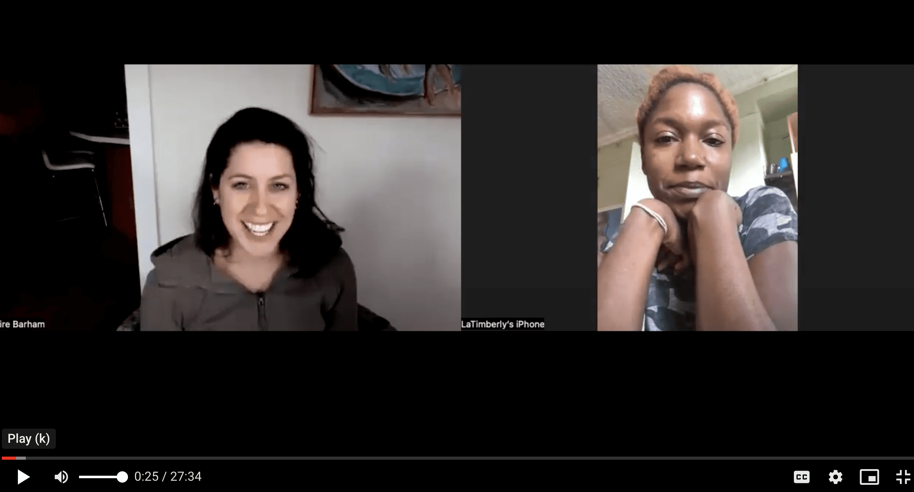
User Interviews ( Initial Round )
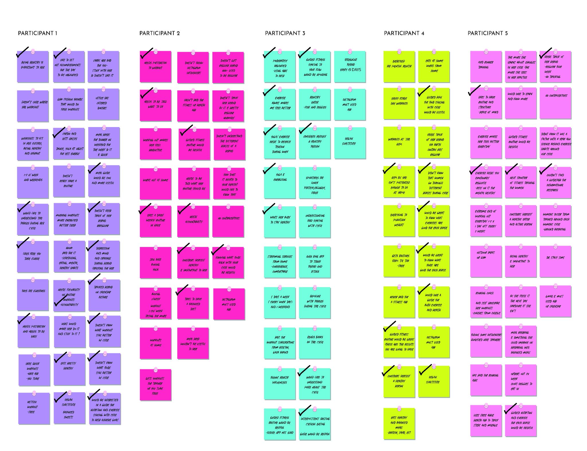
Round 1 Affinity Mapping
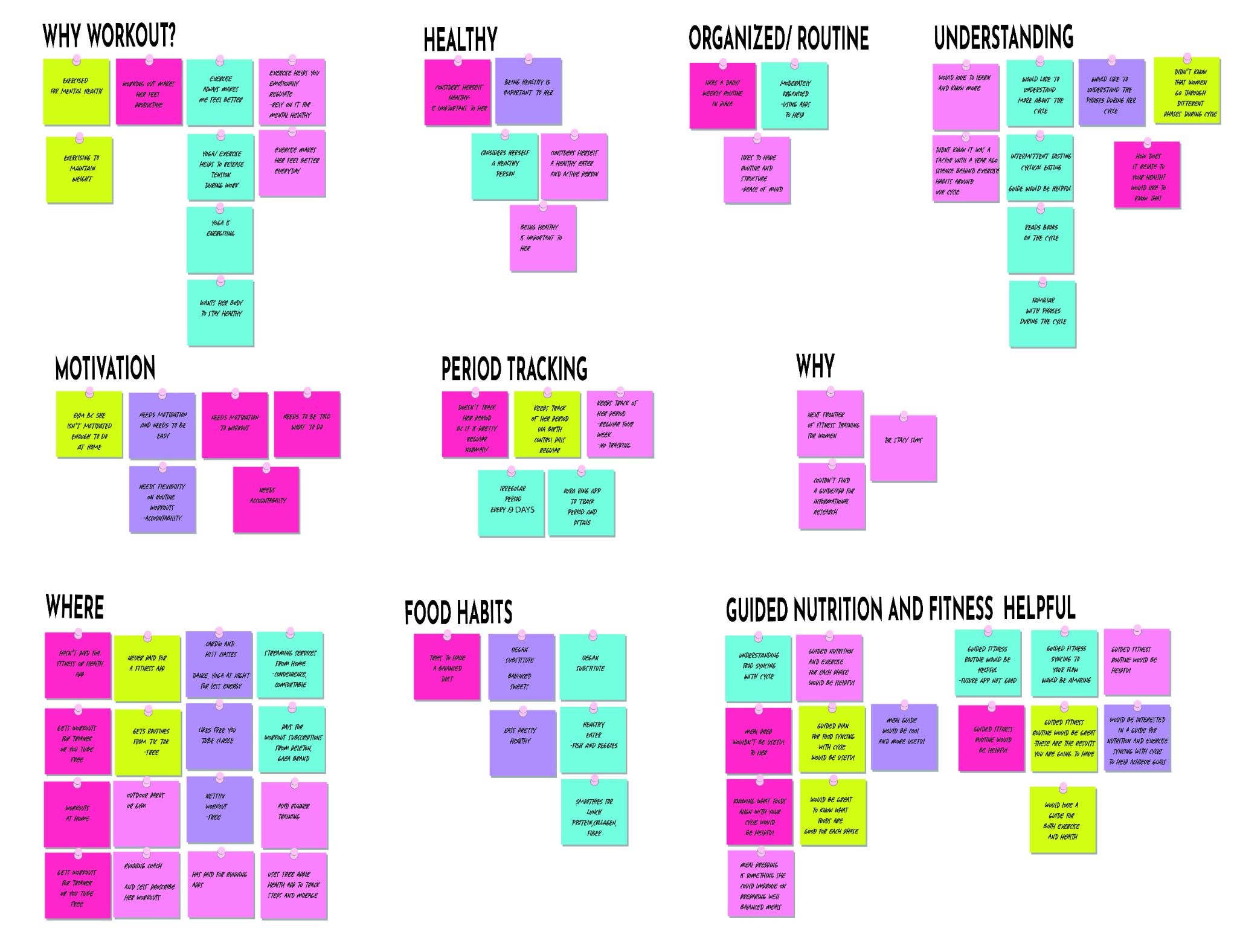
Round 2 Affinity Mapping
I was able to compare what were the common needs and pain point were from the users after synthesizing my notes.
Personas & User Flows
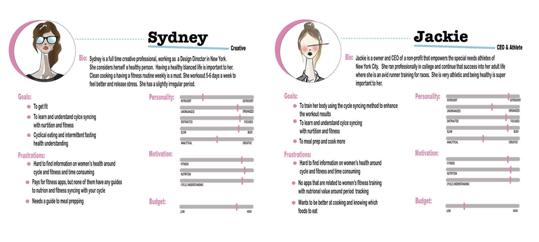
After compiling data from my interviews, I was able to create two personas to represent our users.
Users want to be healthy and get fit by understanding their bodies
No apps related to fitness training around cycle and nutrition exist that have good information and accountability
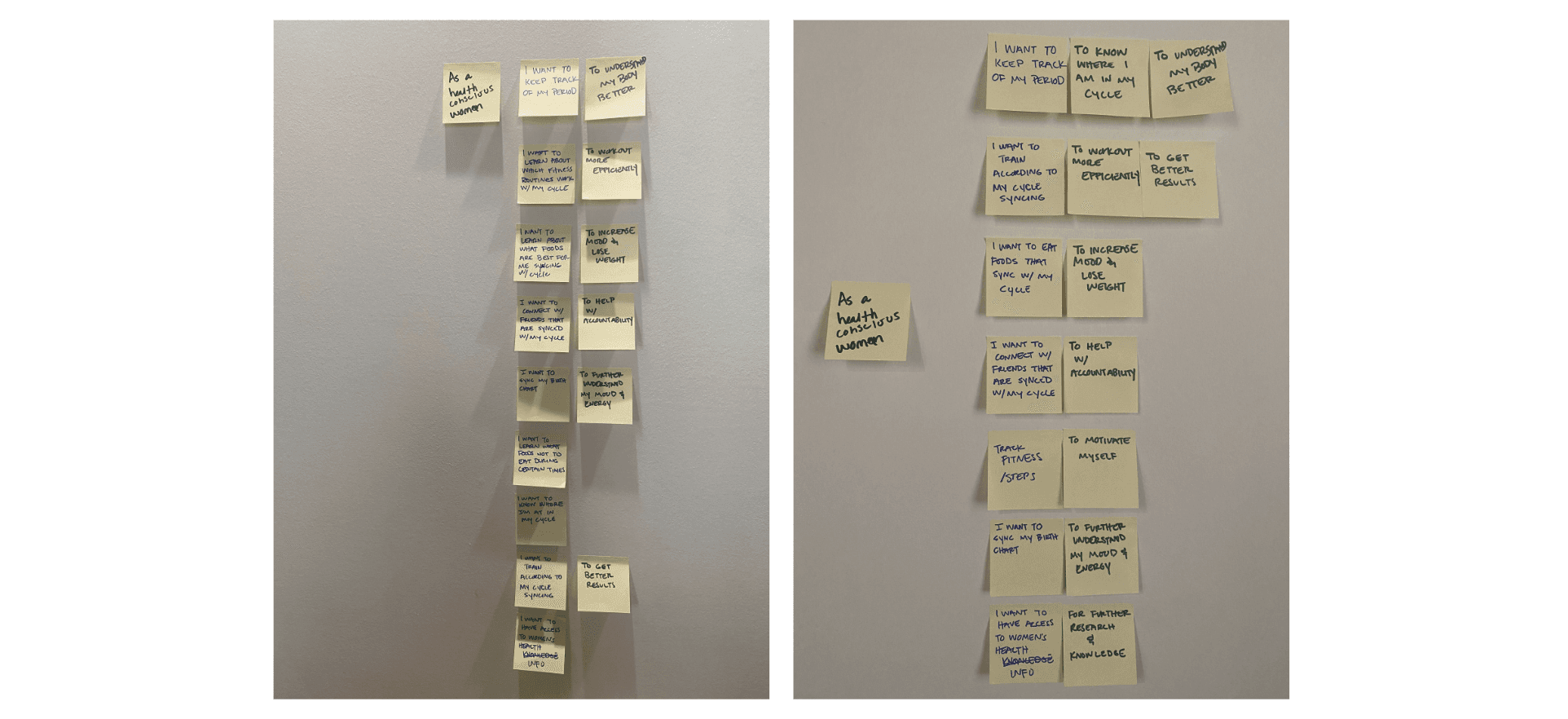
When thinking out the user stories from the information I had gathered, it helped to be be more informed to create the red routes for the app
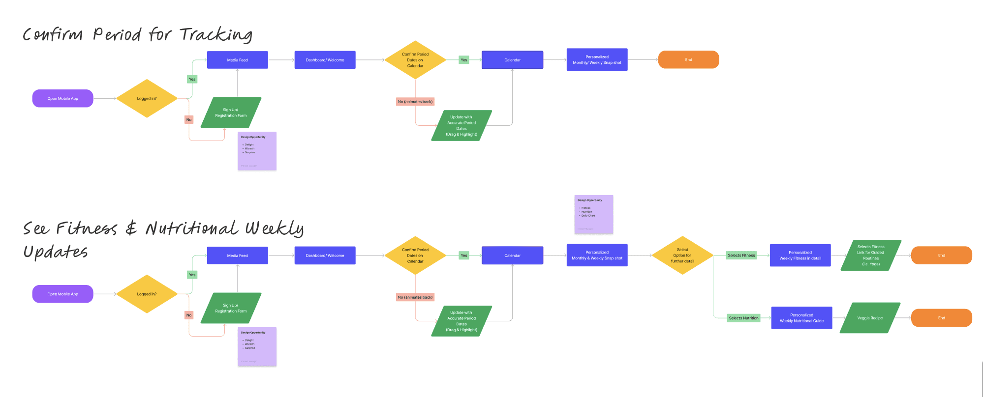
Primary User Flows
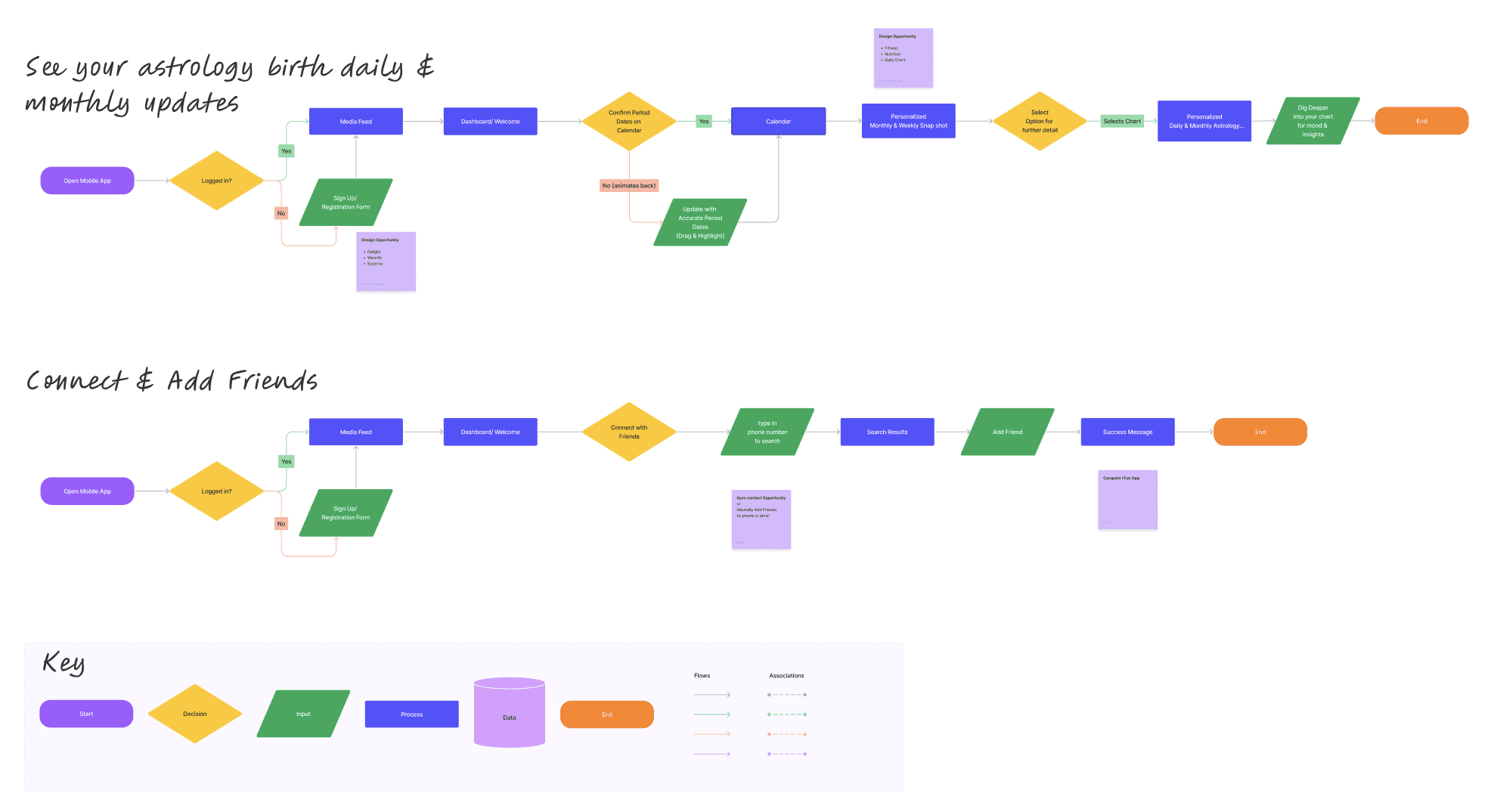
Secondary User Flows
Ideate
After getting a better understanding of how the user discovers information on fitness and nutrition pertaining to their current menstruation cycle tracking , what the FEM team was looking to improve, and what their competitors are doing, it was time to start exploring some design solutions. I was working on the visual and UX simultaneously; nailing down a new, elevated design direction, and figuring out how to implement new additional features.
Based on my research, there were a few areas I found were key:
· Increase focus on social connection and accountability and to bolster consumer confidence and drive more business.
· It should be as easy as possible for the user to find what they are needing and have the option for notifications to keep them on track for success.
· Focus on ease of use, transparency, communication, and supporting content.
· Expand content use related to company values, product quality, and DE&I to increase acquisition and brand loyalty.
· Use natural colors in combination with clean design aesthetics. Use model & product photography that is modern, diverse, and natural, yet approachable
Wireframing
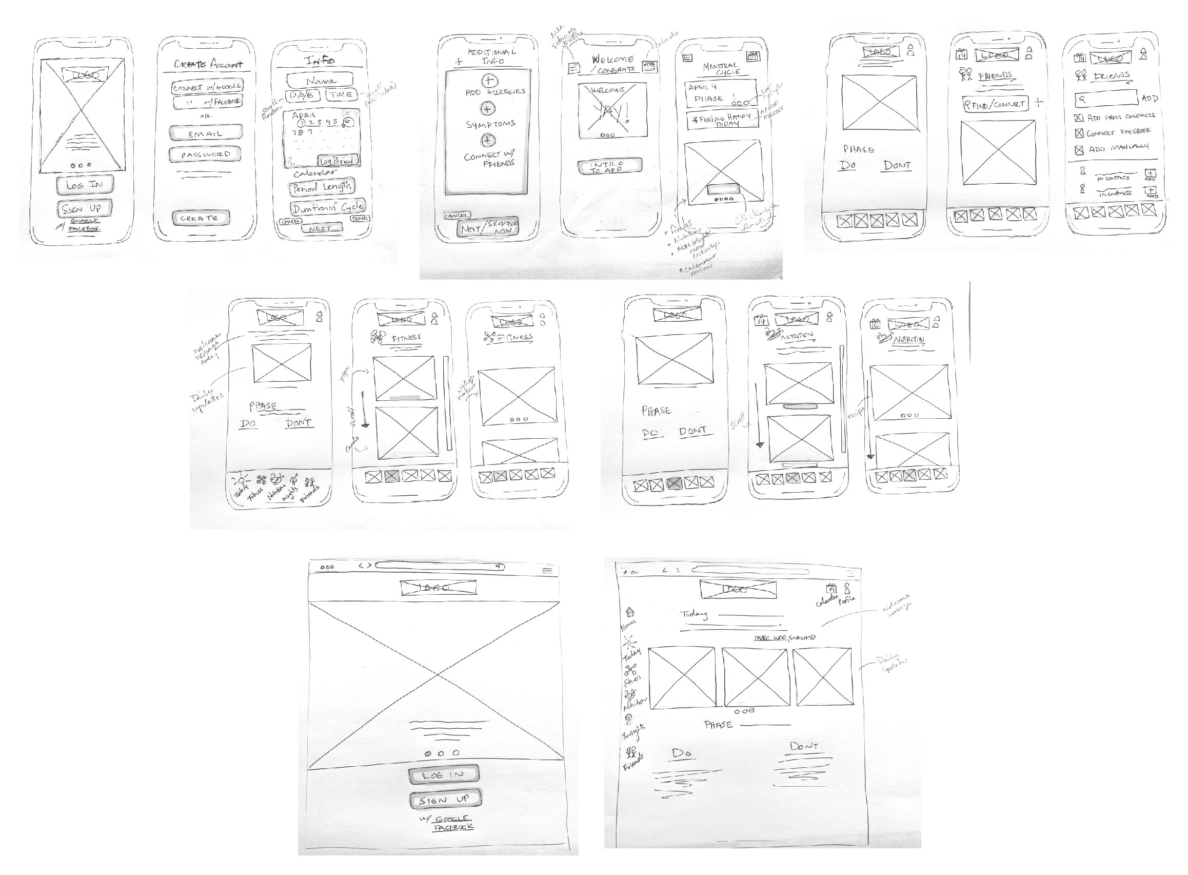
Starting with hand sketches to get an idea of the layout helped process before heading into low-fidelity screens. This a great start for discussions around the app idea.
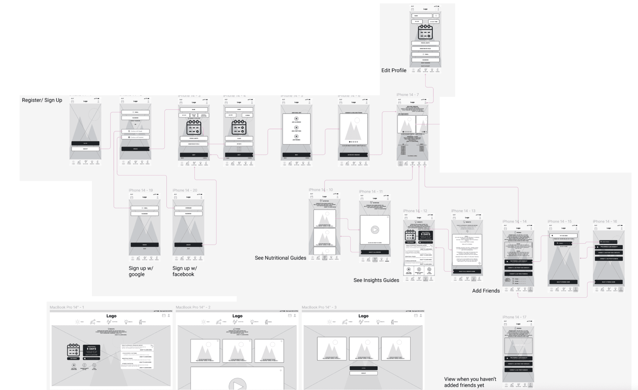
I was able to use my low-fidelity screens to create the flow of the red routes for the user sign up. These offered a quick way to get feedback with users before moving into visual designs.
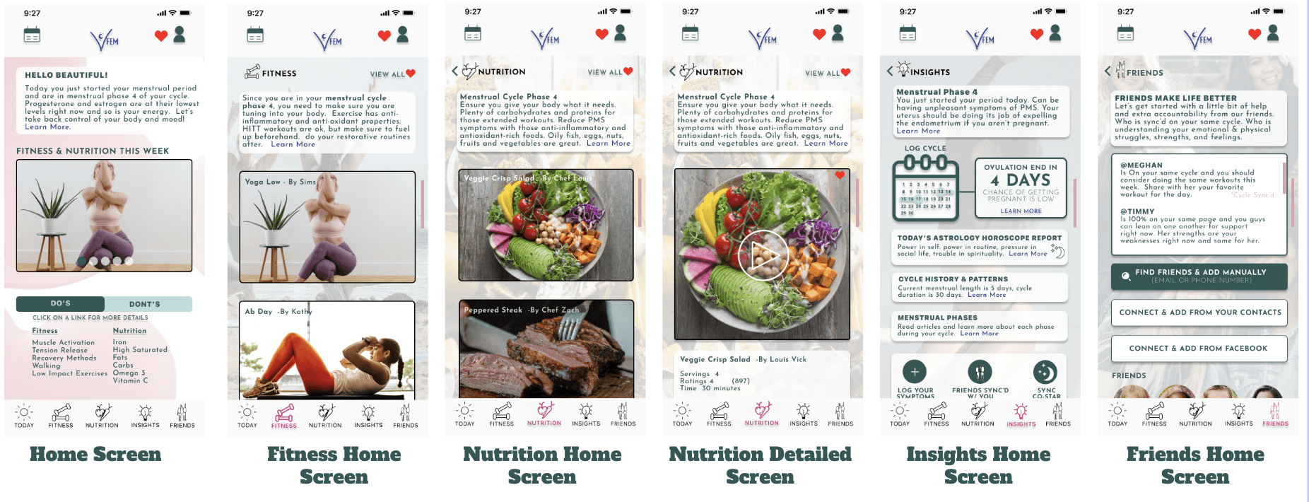
Creating wireframes in hi-fidelity allowed me to be able to put my designs into a prototype to get feedback from my users on key functions.
Design
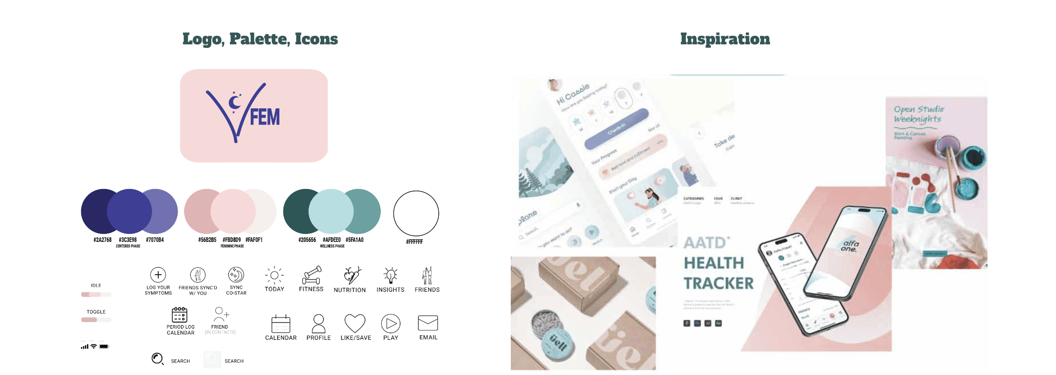
My intention for the branding design and guidelines were to come off modern, yet feminine.
With the usage of soft and muted tones for the color palette, allowed for that femininity feel.
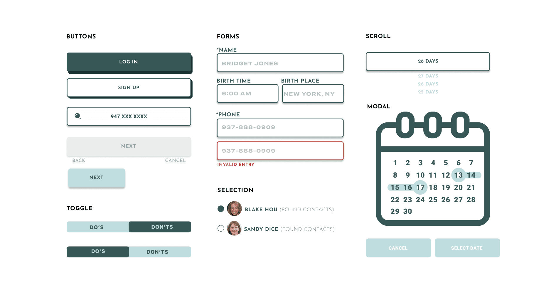
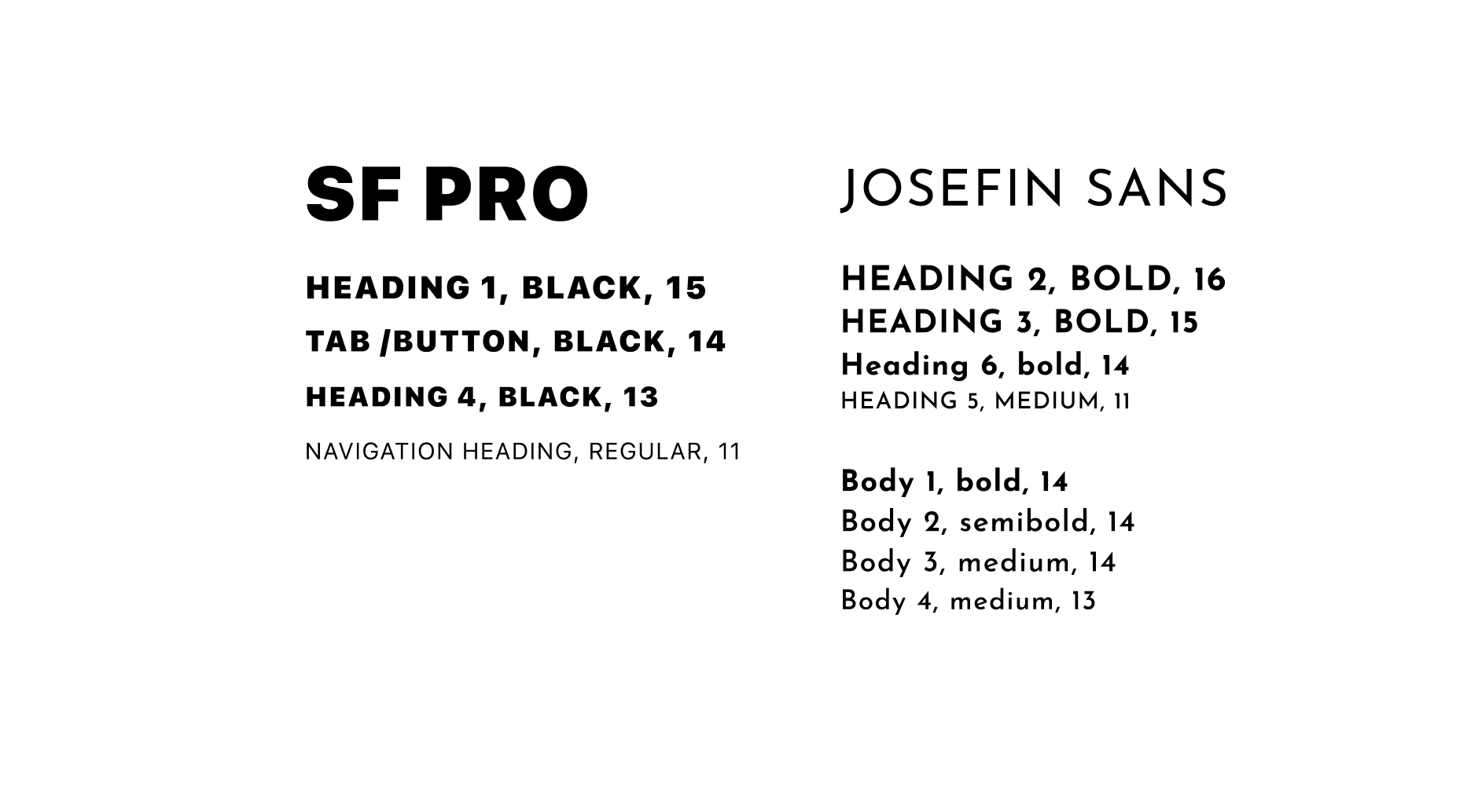
The clean and modern lines throughout the design within the icons, buttons, and typography, allow for an easy read with a minimalistic feel.
The mixture of these two feminine and modern offsets express feminine strength.
Branding, Logo, and Icon
Design Systems
Typography
Usability Testing
After conducting several prototype testing, I was able to use that feedback to make solid improvements to my design.
Usability Testing Report (click to check out the report & results)

Key Findings:
Crowded design
Don't know what images are that they are seeing
Signing up confusion on calendar and which inputs are required
Background is overshadowing the text
Would like to know the duration and steps of the workout
Key Recommendation:
Add Swipe & scroll functions to consolidate and spread out content
Add descriptive text to images
Add description to calendar and * next to require inputs on form
Lighten up the background to make text more visible
Add duration length and description to workouts
The Solution
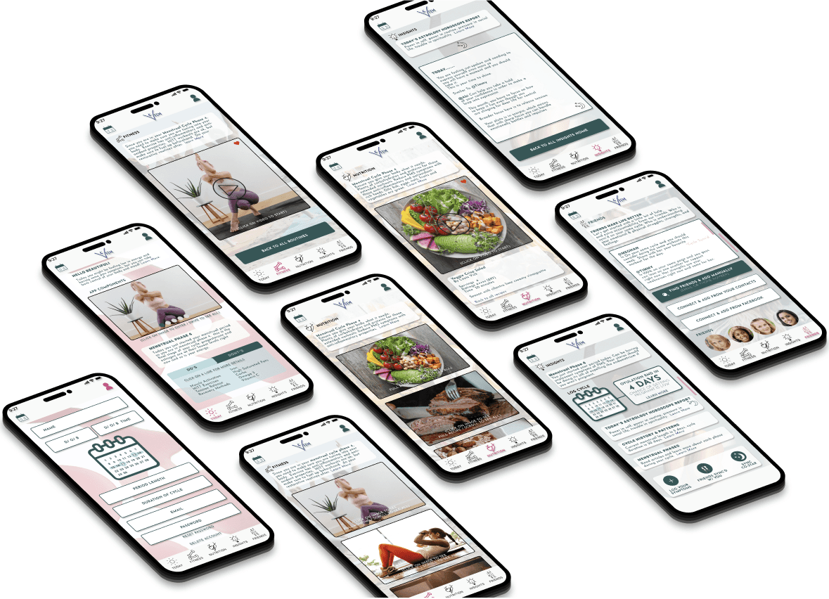
I ended up with a clean streamlined and aesthetically pleasing design for our users. The key components of the app easy to find by users throughout the app navigation on the bottom bar.
The users will always also have access to their profile and calendar for quick updating.
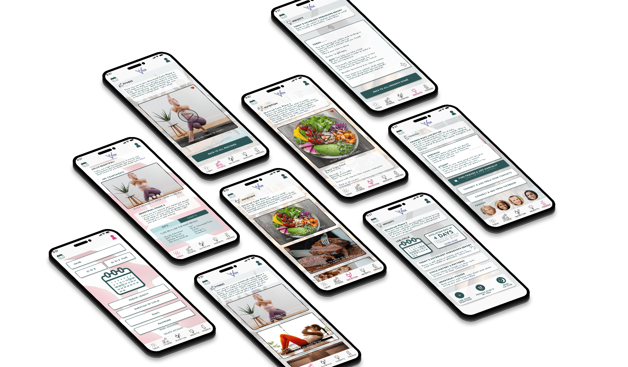
Signing up as a new user
The user can sign up multiple ways to make the sign up process easier for them. They will have the option to input their birthday and period dates for syncing to their cycle and astrology for mood and updates.
Find a fitness routine and a recipe for the day
The users can easily navigate to see what fitness routines and nutritional meals are best depending on where they are in their menstrual cycle.
Browse through your insights for the day based on astrology
The users can browse through the app to see their insights for the day based on their birthday for astrology updates. This is an added feature you can connect through a partnership with the Co-Star app.
Add friends for that extra accountability
Adding friends is also an added feature to keep users connected and encourage them through accountability. The user can see which friends are on their same cycle and choose to do fitness routines together as well as keep each other on track with their nutrition.
View your profile and menstrual cycle calendar for updates
The user can easily go to their profile and calendar if they need to update any of their information.
Results
Giving relief to our user as now they have a place they can go for all their women needs!
I learned to focus on the most important needs for women to prioritize (the red routes) when finalizing this product.
As a result, I created a product that makes being a woman a little easier; reducing those expressed pain points for my users. All information into one app with easy access to workouts, recipes, and accountability.
I am a very active person, but my needs differed from those of my users. I learned that in order to be a great UX designer, you need to think of your user's needs and not your own to tap into what will make a successful product.
Happy. Healthy. Organized. Connected. Knowledgeable.

Let's work
together
Project - FEM
The Problem Space
It's said that 50 million women worldwide use period trackers for fertility and ovulation tracking. Why not more?
This is a space where women can gain understanding regarding their cycle and get better health results from eating and working out accordingly. This does not exist in one app.
The information surrounding women's health and syncing their workouts / nutrition with their cycle is hard to find. Women don't have the knowledge and understanding of how impactful tracking their period can be.

Goals
"Observing your menstrual cycle can alert you to ideal times to socialize do focused work, be intimate, increase train intensity, or prioritize some R&R."
I created an app designed for women to gain insight, connection, and health results.

User-Centric Design: Create an intuitive and visually appealing interface that would make it easy for users to navigate through different workout routines, health and diet recipes, and connection features.
Personalization: Develop an algorithm that would analyze user inputs and tracking data to suggest tailored workout plans, and food suggestions ensuring an individualized experience.
Gamification: Implement gamification elements, such as achievements, challenges, and rewards, to enhance user engagement and motivation.
Seamless Integration & connection: Ensure smooth integration with fitness trackers, community connection and other health apps, enabling users to sync and track their progress effortlessly.
Discovery
21 women were surveyed and 15 women were interview for this research. After several months of meticulous interviewing, affinity mapping methods, and ideation.

I gained the following insights:
There's a lack of information around women's period tracking pertaining to nutrition and fitness.
Takes time to research to find material on the menstrual cycle and different phases that women's go through in a cycle.
Women want a guideline to follow for nutrition and fitness that syncs with their cycle to understand their bodies maintaining a healthy lifestyle.
Step 1: Competitor Analysis
Step 2: Screener Survey (check out the survey that was sent out)
Step 3: User Interviews
Step 4: Affinity Mapping
User Interviews ( Initial Round )

Round 1 Affinity Mapping

Round 2 Affinity Mapping
I was able to compare what were the common needs and pain point were from the users after synthesizing my notes.

Personas & User Flows
After compiling data from my interviews, I was able to create two personas to represent our users.
Users want to be healthy and get fit by understanding their bodies
No apps related to fitness training around cycle and nutrition exist that have good information and accountability

When thinking out the user stories from the information I had gathered, it helped to be be more informed to create the red routes for the app

Primary User Flows

Secondary User Flows

Ideate
After getting a better understanding of how the user discovers information on fitness and nutrition pertaining to their current menstruation cycle tracking , what the FEM team was looking to improve, and what their competitors are doing, it was time to start exploring some design solutions. I was working on the visual and UX simultaneously; nailing down a new, elevated design direction, and figuring out how to implement new additional features.
Based on my research, there were a few areas I found were key:
· Increase focus on social connection and accountability and to bolster consumer confidence and drive more business.
· It should be as easy as possible for the user to find what they are needing and have the option for notifications to keep them on track for success.
· Focus on ease of use, transparency, communication, and supporting content.
· Expand content use related to company values, product quality, and DE&I to increase acquisition and brand loyalty.
· Use natural colors in combination with clean design aesthetics. Use model & product photography that is modern, diverse, and natural, yet approachable
Wireframing
Starting with hand sketches to get an idea of the layout helped process before heading into low-fidelity screens. This a great start for discussions around the app idea.

I was able to use my low-fidelity screens to create the flow of the red routes for the user sign up. These offered a quick way to get feedback with users before moving into visual designs.

Creating wireframes in hi-fidelity allowed me to be able to put my designs into a prototype to get feedback from my users on key functions.

Design
My intention for the branding design and guidelines were to come off modern, yet feminine.
With the usage of soft and muted tones for the color palette, allowed for that femininity feel.
The clean and modern lines throughout the design within the icons, buttons, and typography, allow for an easy read with a minimalistic feel.
The mixture of these two feminine and modern offsets express feminine strength.
Branding, Logo, and Icon

Design Systems

Typography

Usability Testing
After conducting several prototype testing, I was able to use that feedback to make solid improvements to my design.
Usability Testing Report (click to check out the report & results)

Key Findings:
Crowded design
Don't know what images are that they are seeing
Signing up confusion on calendar and which inputs are required
Background is overshadowing the text
Would like to know the duration and steps of the workout
Key Recommendation:
Add Swipe & scroll functions to consolidate and spread out content
Add descriptive text to images
Add description to calendar and * next to require inputs on form
Lighten up the background to make text more visible
Add duration length and description to workouts
The Solution
I ended up with a clean streamlined and aesthetically pleasing design for our users. The key components of the app easy to find by users throughout the app navigation on the bottom bar.
The users will always also have access to their profile and calendar for quick updating.

Signing up as a new user
The user can sign up multiple ways to make the sign up process easier for them. They will have the option to input their birthday and period dates for syncing to their cycle and astrology for mood and updates.
Find a fitness routine and a recipe for the day
The users can easily navigate to see what fitness routines and nutritional meals are best depending on where they are in their menstrual cycle.
Browse through your insights for the day based on astrology
The users can browse through the app to see their insights for the day based on their birthday for astrology updates. This is an added feature you can connect through a partnership with the Co-Star app.
Add friends for that extra accountability
Adding friends is also an added feature to keep users connected and encourage them through accountability. The user can see which friends are on their same cycle and choose to do fitness routines together as well as keep each other on track with their nutrition.
View your profile and menstrual cycle calendar for updates
The user can easily go to their profile and calendar if they need to update any of their information.
Results
Giving relief to our user as now they have a place they can go for all their women needs!
I learned to focus on the most important needs for women to prioritize (the red routes) when finalizing this product.
As a result, I created a product that makes being a woman a little easier; reducing those expressed pain points for my users. All information into one app with easy access to workouts, recipes, and accountability.
I am a very active person, but my needs differed from those of my users. I learned that in order to be a great UX designer, you need to think of your user's needs and not your own to tap into what will make a successful product.
Happy. Healthy. Organized. Connected. Knowledgeable.

Let's work
together
Project - FEM
The Problem Space
It's said that 50 million women worldwide use period trackers for fertility and ovulation tracking. Why not more?
This is a space where women can gain understanding regarding their cycle and get better health results from eating and working out accordingly. This does not exist in one app.
The information surrounding women's health and syncing their workouts / nutrition with their cycle is hard to find. Women don't have the knowledge and understanding of how impactful tracking their period can be.

Goals
"Observing your menstrual cycle can alert you to ideal times to socialize do focused work, be intimate, increase train intensity, or prioritize some R&R."
I created an app designed for women to gain insight, connection, and health results.

User-Centric Design: Create an intuitive and visually appealing interface that would make it easy for users to navigate through different workout routines, health and diet recipes, and connection features.
Personalization: Develop an algorithm that would analyze user inputs and tracking data to suggest tailored workout plans, and food suggestions ensuring an individualized experience.
Gamification: Implement gamification elements, such as achievements, challenges, and rewards, to enhance user engagement and motivation.
Seamless Integration & connection: Ensure smooth integration with fitness trackers, community connection and other health apps, enabling users to sync and track their progress effortlessly.
Discovery
21 women were surveyed and 15 women were interview for this research. After several months of meticulous interviewing, affinity mapping methods, and ideation.

I gained the following insights:
There's a lack of information around women's period tracking pertaining to nutrition and fitness.
Takes time to research to find material on the menstrual cycle and different phases that women's go through in a cycle.
Women want a guideline to follow for nutrition and fitness that syncs with their cycle to understand their bodies maintaining a healthy lifestyle.
Step 1: Competitor Analysis
Step 2: Screener Survey (check out the survey that was sent out)
Step 3: User Interviews
Step 4: Affinity Mapping
User Interviews ( Initial Round )

Round 1 Affinity Mapping

Round 2 Affinity Mapping
I was able to compare what were the common needs and pain point were from the users after synthesizing my notes.

Personas & User Flows
After compiling data from my interviews, I was able to create two personas to represent our users.
Users want to be healthy and get fit by understanding their bodies
No apps related to fitness training around cycle and nutrition exist that have good information and accountability

When thinking out the user stories from the information I had gathered, it helped to be be more informed to create the red routes for the app

Primary User Flows

Secondary User Flows

Ideate
After getting a better understanding of how the user discovers information on fitness and nutrition pertaining to their current menstruation cycle tracking , what the FEM team was looking to improve, and what their competitors are doing, it was time to start exploring some design solutions. I was working on the visual and UX simultaneously; nailing down a new, elevated design direction, and figuring out how to implement new additional features.
Based on my research, there were a few areas I found were key:
· Increase focus on social connection and accountability and to bolster consumer confidence and drive more business.
· It should be as easy as possible for the user to find what they are needing and have the option for notifications to keep them on track for success.
· Focus on ease of use, transparency, communication, and supporting content.
· Expand content use related to company values, product quality, and DE&I to increase acquisition and brand loyalty.
· Use natural colors in combination with clean design aesthetics. Use model & product photography that is modern, diverse, and natural, yet approachable
Wireframing
Starting with hand sketches to get an idea of the layout helped process before heading into low-fidelity screens. This a great start for discussions around the app idea.

I was able to use my low-fidelity screens to create the flow of the red routes for the user sign up. These offered a quick way to get feedback with users before moving into visual designs.

Creating wireframes in hi-fidelity allowed me to be able to put my designs into a prototype to get feedback from my users on key functions.

Design
My intention for the branding design and guidelines were to come off modern, yet feminine.
With the usage of soft and muted tones for the color palette, allowed for that femininity feel.
The clean and modern lines throughout the design within the icons, buttons, and typography, allow for an easy read with a minimalistic feel.
The mixture of these two feminine and modern offsets express feminine strength.
Branding, Logo, and Icon

Design Systems

Typography

Usability Testing
After conducting several prototype testing, I was able to use that feedback to make solid improvements to my design.
Usability Testing Report (click to check out the report & results)

Key Findings:
Crowded design
Don't know what images are that they are seeing
Signing up confusion on calendar and which inputs are required
Background is overshadowing the text
Would like to know the duration and steps of the workout
Key Recommendation:
Add Swipe & scroll functions to consolidate and spread out content
Add descriptive text to images
Add description to calendar and * next to require inputs on form
Lighten up the background to make text more visible
Add duration length and description to workouts
The Solution
I ended up with a clean streamlined and aesthetically pleasing design for our users. The key components of the app easy to find by users throughout the app navigation on the bottom bar.
The users will always also have access to their profile and calendar for quick updating.

Signing up as a new user
The user can sign up multiple ways to make the sign up process easier for them. They will have the option to input their birthday and period dates for syncing to their cycle and astrology for mood and updates.
Find a fitness routine and a recipe for the day
The users can easily navigate to see what fitness routines and nutritional meals are best depending on where they are in their menstrual cycle.
Browse through your insights for the day based on astrology
The users can browse through the app to see their insights for the day based on their birthday for astrology updates. This is an added feature you can connect through a partnership with the Co-Star app.
Add friends for that extra accountability
Adding friends is also an added feature to keep users connected and encourage them through accountability. The user can see which friends are on their same cycle and choose to do fitness routines together as well as keep each other on track with their nutrition.
View your profile and menstrual cycle calendar for updates
The user can easily go to their profile and calendar if they need to update any of their information.
Results
Giving relief to our user as now they have a place they can go for all their women needs!
I learned to focus on the most important needs for women to prioritize (the red routes) when finalizing this product.
As a result, I created a product that makes being a woman a little easier; reducing those expressed pain points for my users. All information into one app with easy access to workouts, recipes, and accountability.
I am a very active person, but my needs differed from those of my users. I learned that in order to be a great UX designer, you need to think of your user's needs and not your own to tap into what will make a successful product.
Happy. Healthy. Organized. Connected. Knowledgeable.

Let's work
together
Project - FEM
The Problem Space
It's said that 50 million women worldwide use period trackers for fertility and ovulation tracking. Why not more?
This is a space where women can gain understanding regarding their cycle and get better health results from eating and working out accordingly. This does not exist in one app.
The information surrounding women's health and syncing their workouts / nutrition with their cycle is hard to find. Women don't have the knowledge and understanding of how impactful tracking their period can be.

Goals
"Observing your menstrual cycle can alert you to ideal times to socialize do focused work, be intimate, increase train intensity, or prioritize some R&R."
I created an app designed for women to gain insight, connection, and health results.

User-Centric Design: Create an intuitive and visually appealing interface that would make it easy for users to navigate through different workout routines, health and diet recipes, and connection features.
Personalization: Develop an algorithm that would analyze user inputs and tracking data to suggest tailored workout plans, and food suggestions ensuring an individualized experience.
Gamification: Implement gamification elements, such as achievements, challenges, and rewards, to enhance user engagement and motivation.
Seamless Integration & connection: Ensure smooth integration with fitness trackers, community connection and other health apps, enabling users to sync and track their progress effortlessly.
Discovery
21 women were surveyed and 15 women were interview for this research. After several months of meticulous interviewing, affinity mapping methods, and ideation.

I gained the following insights:
There's a lack of information around women's period tracking pertaining to nutrition and fitness.
Takes time to research to find material on the menstrual cycle and different phases that women's go through in a cycle.
Women want a guideline to follow for nutrition and fitness that syncs with their cycle to understand their bodies maintaining a healthy lifestyle.
Step 1: Competitor Analysis
Step 2: Screener Survey (check out the survey that was sent out)
Step 3: User Interviews
Step 4: Affinity Mapping
User Interviews ( Initial Round )

Round 1 Affinity Mapping

Round 2 Affinity Mapping
I was able to compare what were the common needs and pain point were from the users after synthesizing my notes.

Personas & User Flows
After compiling data from my interviews, I was able to create two personas to represent our users.
Users want to be healthy and get fit by understanding their bodies
No apps related to fitness training around cycle and nutrition exist that have good information and accountability

When thinking out the user stories from the information I had gathered, it helped to be be more informed to create the red routes for the app

Primary User Flows

Secondary User Flows

Ideate
After getting a better understanding of how the user discovers information on fitness and nutrition pertaining to their current menstruation cycle tracking , what the FEM team was looking to improve, and what their competitors are doing, it was time to start exploring some design solutions. I was working on the visual and UX simultaneously; nailing down a new, elevated design direction, and figuring out how to implement new additional features.
Based on my research, there were a few areas I found were key:
· Increase focus on social connection and accountability and to bolster consumer confidence and drive more business.
· It should be as easy as possible for the user to find what they are needing and have the option for notifications to keep them on track for success.
· Focus on ease of use, transparency, communication, and supporting content.
· Expand content use related to company values, product quality, and DE&I to increase acquisition and brand loyalty.
· Use natural colors in combination with clean design aesthetics. Use model & product photography that is modern, diverse, and natural, yet approachable
Wireframing
Starting with hand sketches to get an idea of the layout helped process before heading into low-fidelity screens. This a great start for discussions around the app idea.

I was able to use my low-fidelity screens to create the flow of the red routes for the user sign up. These offered a quick way to get feedback with users before moving into visual designs.

Creating wireframes in hi-fidelity allowed me to be able to put my designs into a prototype to get feedback from my users on key functions.

Design
My intention for the branding design and guidelines were to come off modern, yet feminine.
With the usage of soft and muted tones for the color palette, allowed for that femininity feel.
The clean and modern lines throughout the design within the icons, buttons, and typography, allow for an easy read with a minimalistic feel.
The mixture of these two feminine and modern offsets express feminine strength.
Branding, Logo, and Icon

Design Systems

Typography

Usability Testing
After conducting several prototype testing, I was able to use that feedback to make solid improvements to my design.
Usability Testing Report (click to check out the report & results)

Key Findings:
Crowded design
Don't know what images are that they are seeing
Signing up confusion on calendar and which inputs are required
Background is overshadowing the text
Would like to know the duration and steps of the workout
Key Recommendation:
Add Swipe & scroll functions to consolidate and spread out content
Add descriptive text to images
Add description to calendar and * next to require inputs on form
Lighten up the background to make text more visible
Add duration length and description to workouts
The Solution
I ended up with a clean streamlined and aesthetically pleasing design for our users. The key components of the app easy to find by users throughout the app navigation on the bottom bar.
The users will always also have access to their profile and calendar for quick updating.

Signing up as a new user
The user can sign up multiple ways to make the sign up process easier for them. They will have the option to input their birthday and period dates for syncing to their cycle and astrology for mood and updates.
Find a fitness routine and a recipe for the day
The users can easily navigate to see what fitness routines and nutritional meals are best depending on where they are in their menstrual cycle.
Browse through your insights for the day based on astrology
The users can browse through the app to see their insights for the day based on their birthday for astrology updates. This is an added feature you can connect through a partnership with the Co-Star app.
Add friends for that extra accountability
Adding friends is also an added feature to keep users connected and encourage them through accountability. The user can see which friends are on their same cycle and choose to do fitness routines together as well as keep each other on track with their nutrition.
View your profile and menstrual cycle calendar for updates
The user can easily go to their profile and calendar if they need to update any of their information.
Results
Giving relief to our user as now they have a place they can go for all their women needs!
I learned to focus on the most important needs for women to prioritize (the red routes) when finalizing this product.
As a result, I created a product that makes being a woman a little easier; reducing those expressed pain points for my users. All information into one app with easy access to workouts, recipes, and accountability.
I am a very active person, but my needs differed from those of my users. I learned that in order to be a great UX designer, you need to think of your user's needs and not your own to tap into what will make a successful product.
Happy. Healthy. Organized. Connected. Knowledgeable.

