Project - VibeON
Challenges
With my help, we will offer an elevated experience to allow users to subscribe and pay for a premium service. "Upgrade ya."
Vibe ON free version has had lots of success, but the current product does not have any call to action prompts to upgrade to the newly premium offerings.

Goals
Objective:
By creating a paid product with better features than the free experience and giving users the opportunity to upgrade to a better product, users will pay the subscription fee. This will lead to a profitable revenue stream.
Create the opportunity for new users to subscribe to the premium product upon registration in the signup flow.
Create the opportunity for returning free users to become paid subscribers in the sign-in flow as well as within the product (once logged in).

Discovery
Through my research, I gathered information on the leading industry competitors.
I discovered what their premium accounts offered vs their free versions. I have found what call to actions were used to entice users to sign up for the paid premium account instead of sticking with the free version.
I spoke with users of these top competitors to discover insights about their experiences while using those services.
I discovered if and why they upgraded from their free services.
I discovered why they choose that specific service over another competitor’s brand.

User Prioritized Needs:
Users want to listen to their music immediately/ no ads
They want a discount or promo deal to join
They need the service to be user friendly
Social interaction is important to the user
Having customization that is person to them is important
Learning about the artist and events pertaining to liked artist
Listening more than one person at a time
Unlimited Skips/ replays
User Interviews ( Initial Round )
This initial round of interviewing was to gain understanding of who the user is. How they think? What makes them make certain choices? What are their routines and how they use current streaming services? How does it fit into their life?
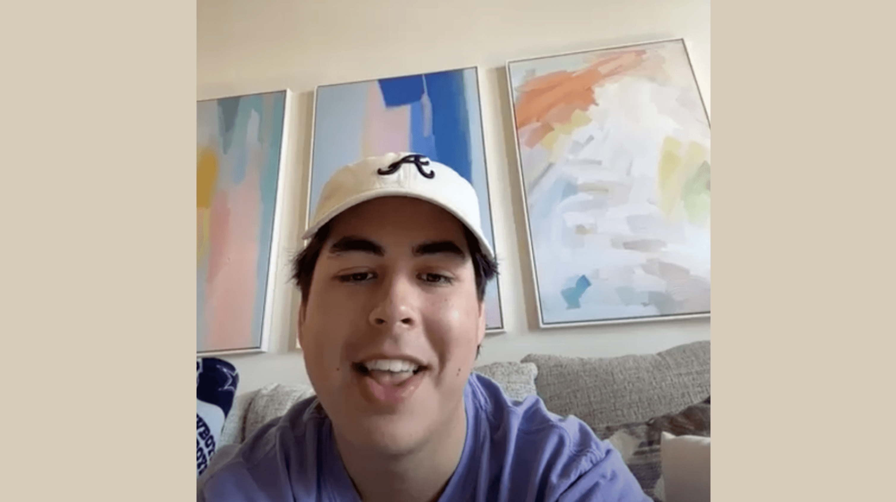
Round 1 - 3 Affinity Mapping
Through the synthesizing process, I was able to categorize not only the users needs and pain point, but also pull information for empathy mapping.
What are the key pain points for our users? What makes them choose a certain service for streaming over another? Why would they switch?
Brand Loyalty/ Grand-fathered In
No Ads
Friends & Artist Connection
Family or Student Discount Options
User Friendly
Cool Features
Personas & User Flows
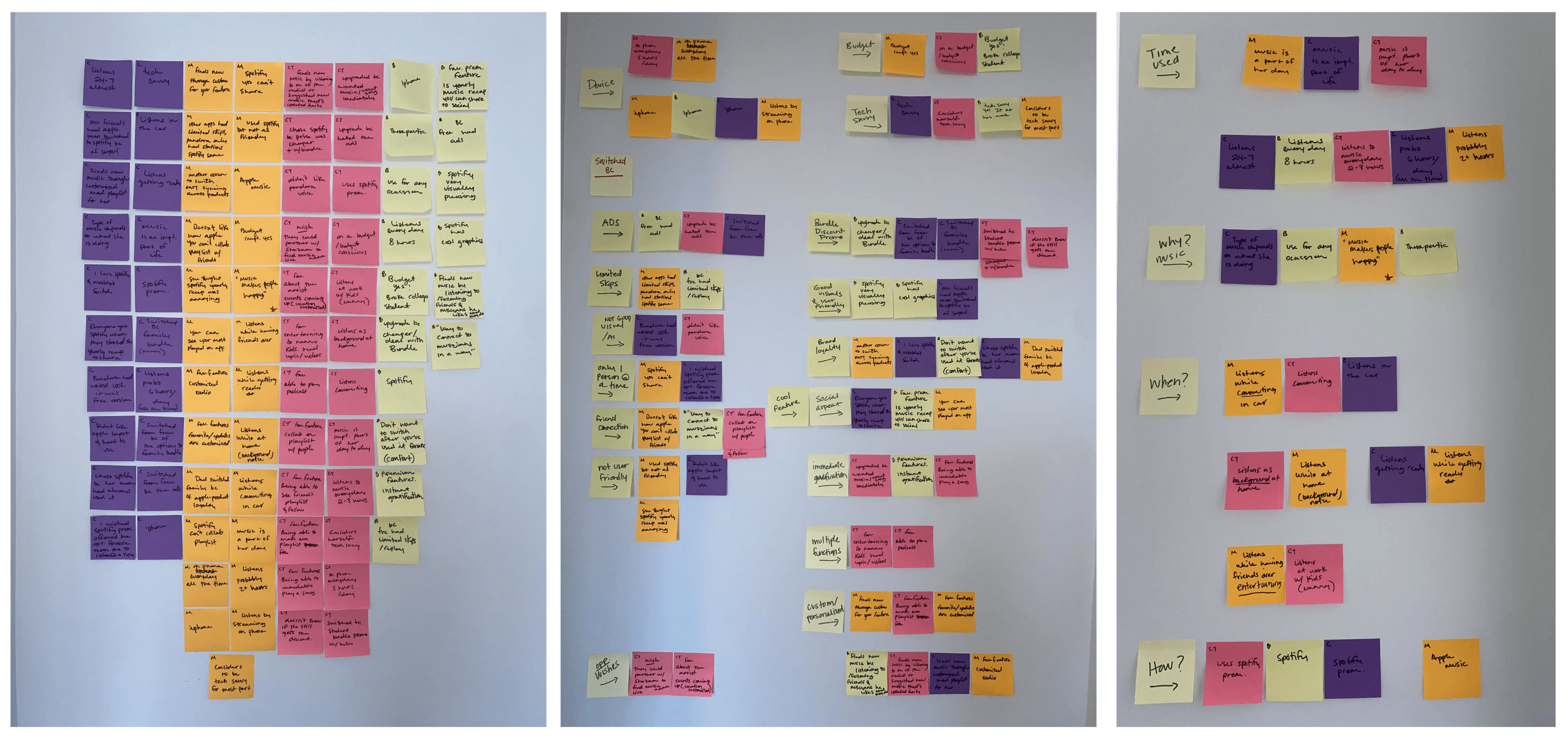
Compiling all the research and interviews conducted, I developed two personas for my app to follow throughout the design and development process.
Keeping these personas in mind helped me to remember what features to include into the premium account and what the most important point were.
With these personas, I was really able to understand each users lifestyle and what exactly their pain points were with current services and more.
User Flows
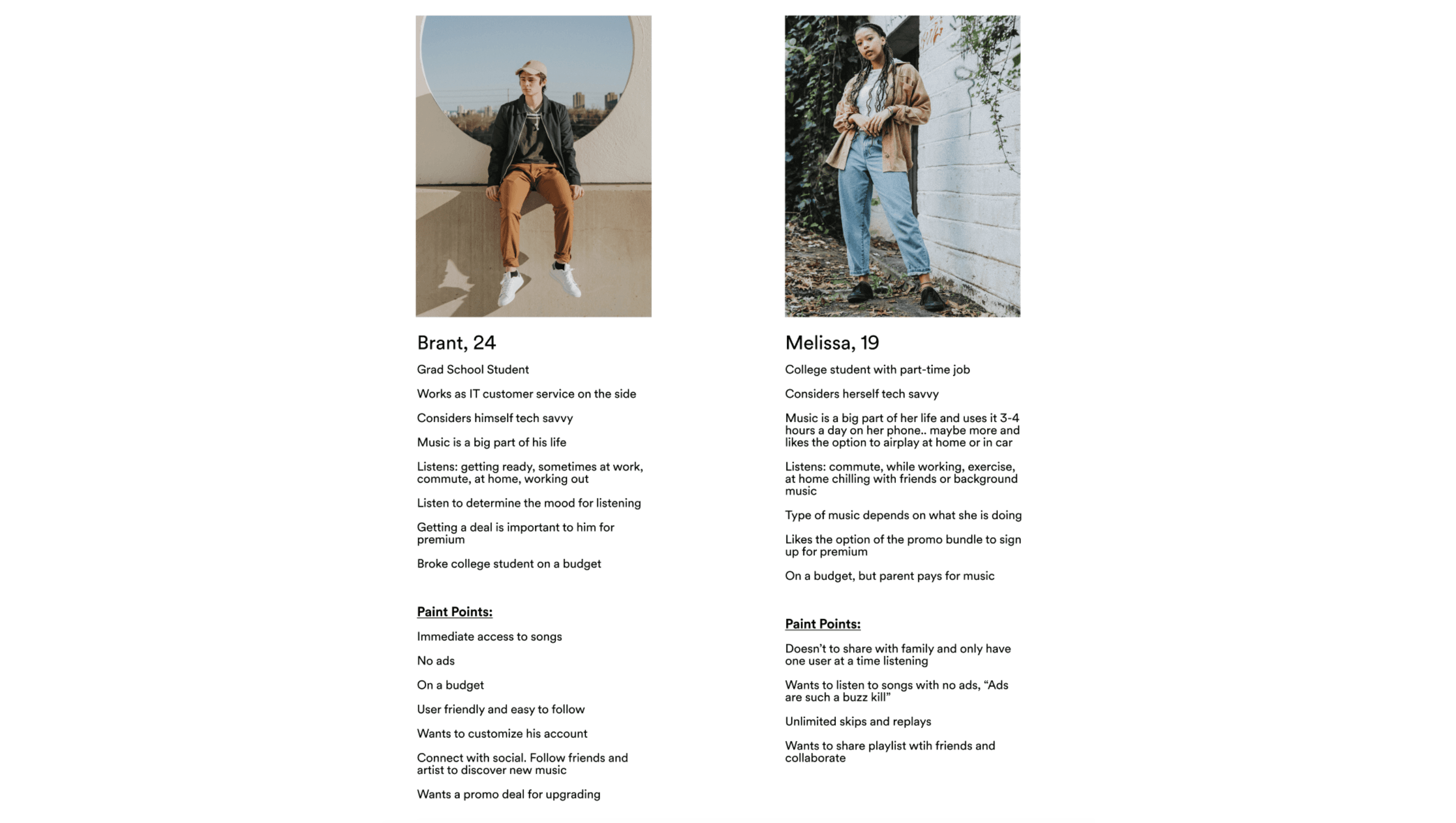
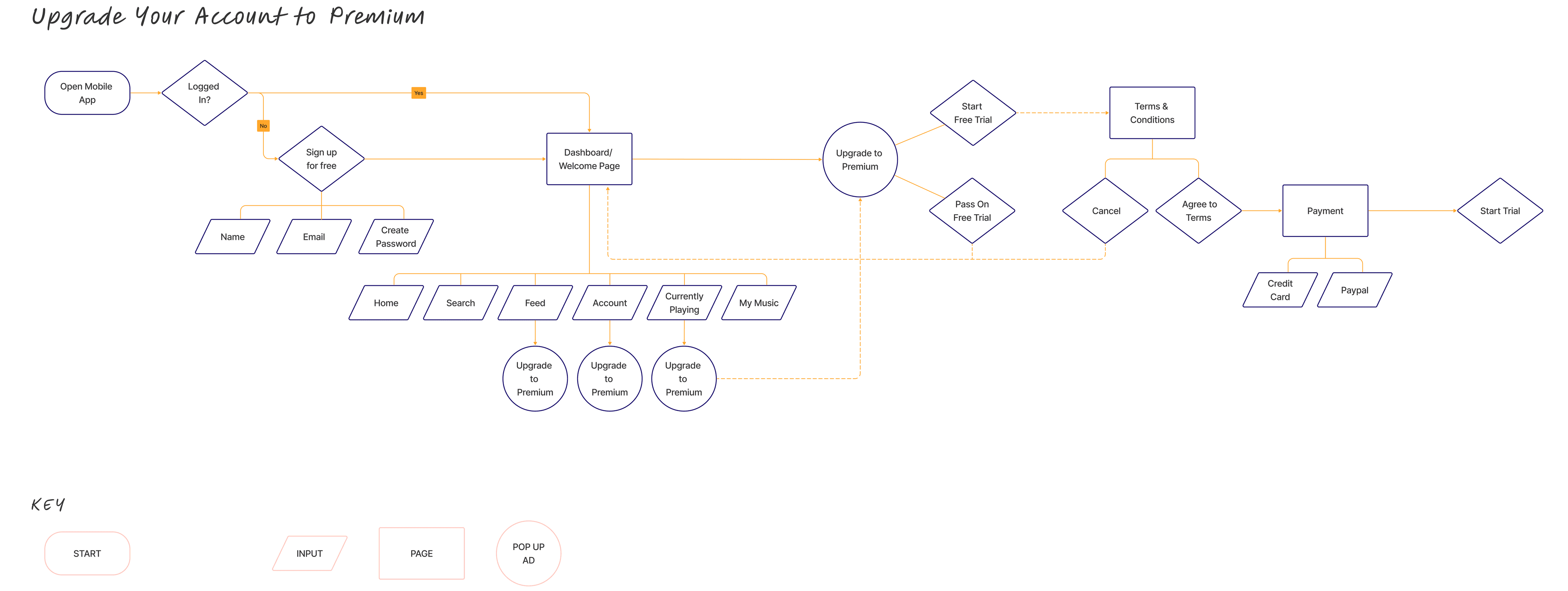
I created a user flow to visualize the steps the user would take to upgrade to a premium account from the free version they currently use.
The visualization of the flow chart was useful during the design process to determine the red routes for the users. Mainly, I was able to see where where the call to action prompts for premium upgrade would be in order to complete the upgrade process.
Ideate
After my research of gathering insights from these users, I started to recognize some possible solutions.
Users want that immediate satisfaction
Solution: Offer No Ads
They want to get a deal
Solution: Offer bundle or discounts for paying upfront
Customization w/ playlist, color themes, ect.
Solution: Offer customizable themes and playlist
Connection is important to them
Solution: Offer collaboration with friends, discovering from artist they follow, share to social option
Discover new music
Solution: Offer Shazam option to listen to songs you hear in the moment
Wireframing
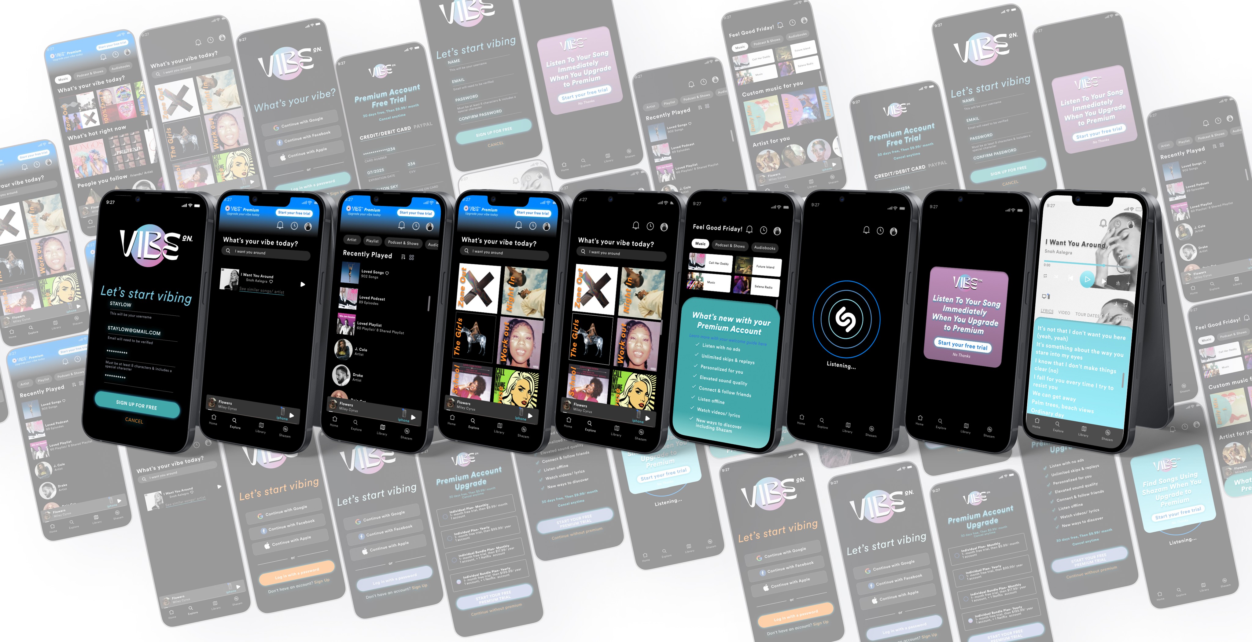
For this project, I choose to start with low-fidelity wireframes due to shorter deadline timing. This helped me to quickly figure out the scale and layout for each screen. I discovered that some of my screens needed to be reworked to fit on the screen and some additional screen were necessary.

Creating my wireframes in hi-fidelity allowed me not only get real feedback from users during the prototyping on functionality, to to see what features users weren't familiar with and change those.
Design
From the stakeholders:
“This service needs to be uniquely diverse, bold, hip, smart, but somehow always familiar"
I wanted the user to feel happy/ nostalgic with the colors and experience we were offering. So, I went with a soft palette with contrast to catch their attention.
Quotes from our users:
" This seems like an app I would use; very familiar to me"
"Love the color and the look overall"
"The words VibeOn makes me happy and reminds me a good times with friends"
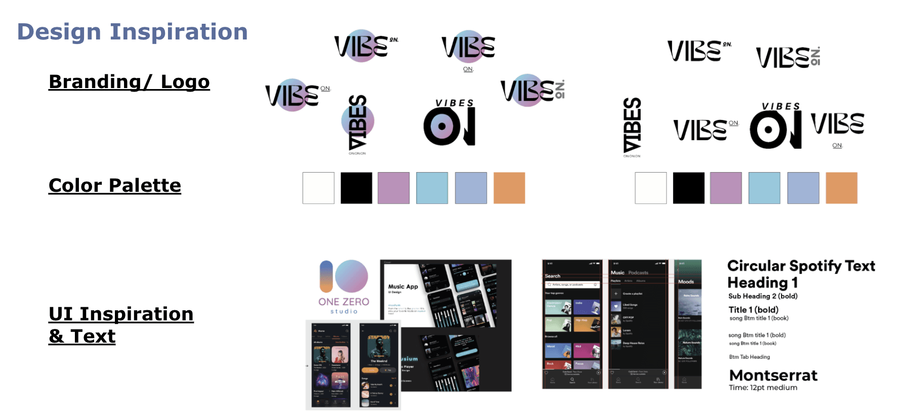
The brand logo came from the idea of a retro record and I wanted to incorporate those same retro cool colors into the theme. For the final design of the logo, I ended up using the cleaner and easier to read version. This was the most liked amongst potential users.
Usability Testing
I interviewed 5 people from the ages 18-25, which was the target age range for this service.
"Ads, while listening to music, are such a buzzkill."
Usability Testing Report (check out the testing report)
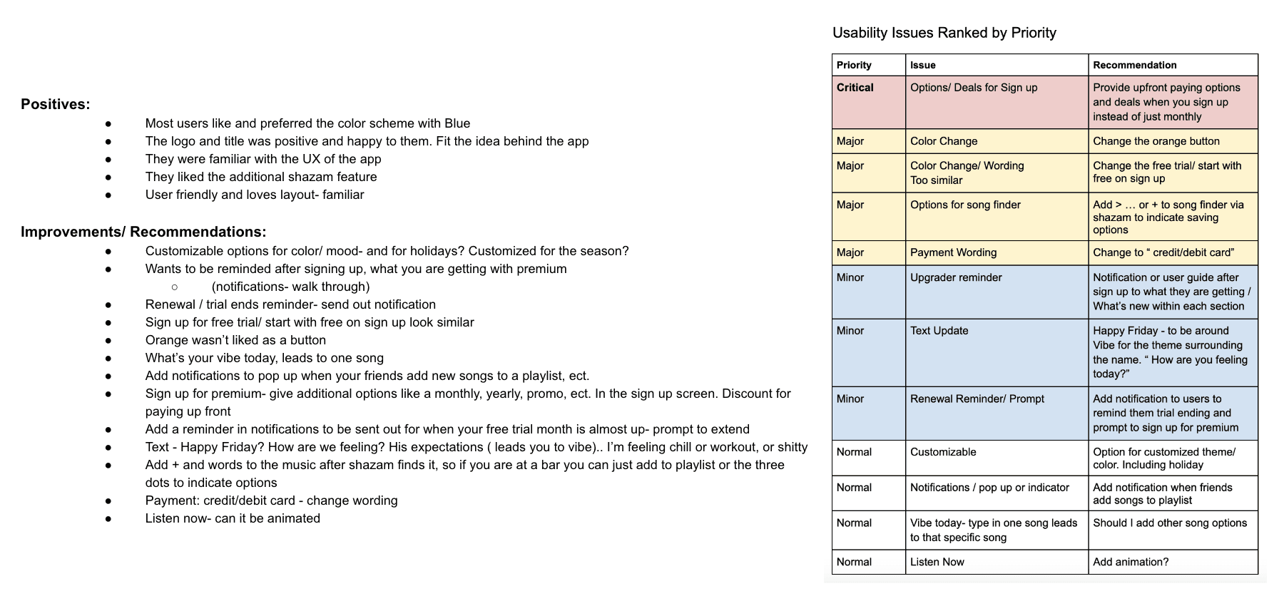
During usability testing, I found some major and minor improvements to be made to the app, which were done in the final stage of design. Overall, the potential users felt the app was very user friendly.
The Solution
The design is simple and understandable to users. It gives the users a good flow and allows them to be connected to social and friends while also disconnecting into their own world of music.
I wanted this service to be customizable for each users, so allowing them the option to play with color schemes, ect. For whatever vibe/ mood they are in.
Throughout the free version, I have added in call to actions for upgrading to premium. While listening, the user will receive ads that include prompts for upgrade along with promos that pop down on each home screen per category.
I have partnered with Shazam along with adding other unique premium features to entice the user to upgrade.
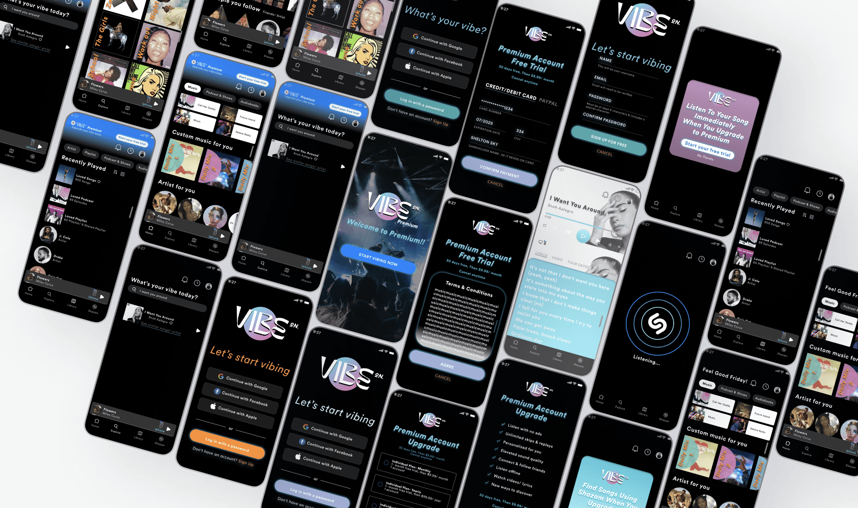
Signing up as a new user
The user choose to sign up and continue with their free account. Throughout the user flow of the app, they will be prompted to sign up for premium. Once they have chosen to sign up for the premium account, they will be able to see exactly what benefits they will now be getting with their new premium account.
Premium account flow through the app with the use of additional features
The user can now browse through their premium account with no more ads. This flow takes the user through the main service features including that additional feature of Shazam for easy music finds.
Results
To design an app that is hip, yet familiar, while also standing out amongst the crowded competitors was the challenge.
I used familiar UX layout to help the user feel comfortable and soft cool colors to bring a happy retro vibe bringing in the cool factor.
Throughout multiple rounds of usability testing, I was able to discover features that stood out to entice users to choose this service over the competitors.
Connection with friends and artist with the ability to collaborate on playlist and follow artist
Family Sharing & Student Discounts
No Ads
Shazam added feature to be able to listen to a song in order to find, add to playlist, and play without leaving the app
The option to see the lyrics, videos, about artist, and tour dates near the user's location
Yes, pop-up ads are annoying. I found that with careful placement and fresh colors for these ads was key to keeping the user engaged and not too annoyed. Along with those added special features only our app would offer, the user will want to upgrade!
Keep vibing on people!

Let's work
together
Project - VibeON
Challenges
With my help, we will offer an elevated experience to allow users to subscribe and pay for a premium service. "Upgrade ya."
Vibe ON free version has had lots of success, but the current product does not have any call to action prompts to upgrade to the newly premium offerings.

Goals
Objective:
By creating a paid product with better features than the free experience and giving users the opportunity to upgrade to a better product, users will pay the subscription fee. This will lead to a profitable revenue stream.
Create the opportunity for new users to subscribe to the premium product upon registration in the signup flow.
Create the opportunity for returning free users to become paid subscribers in the sign-in flow as well as within the product (once logged in).

Discovery
Through my research, I gathered information on the leading industry competitors.
I discovered what their premium accounts offered vs their free versions. I have found what call to actions were used to entice users to sign up for the paid premium account instead of sticking with the free version.
I spoke with users of these top competitors to discover insights about their experiences while using those services.
I discovered if and why they upgraded from their free services.
I discovered why they choose that specific service over another competitor’s brand.

User Prioritized Needs:
Users want to listen to their music immediately/ no ads
They want a discount or promo deal to join
They need the service to be user friendly
Social interaction is important to the user
Having customization that is person to them is important
Learning about the artist and events pertaining to liked artist
Listening more than one person at a time
Unlimited Skips/ replays
User Interviews ( Initial Round )
This initial round of interviewing was to gain understanding of who the user is. How they think? What makes them make certain choices? What are their routines and how they use current streaming services? How does it fit into their life?

Round 1 - 3 Affinity Mapping
Through the synthesizing process, I was able to categorize not only the users needs and pain point, but also pull information for empathy mapping.
What are the key pain points for our users? What makes them choose a certain service for streaming over another? Why would they switch?
Brand Loyalty/ Grand-fathered In
No Ads
Friends & Artist Connection
Family or Student Discount Options
User Friendly
Cool Features

Personas & User Flows
Compiling all the research and interviews conducted, I developed two personas for my app to follow throughout the design and development process.
Keeping these personas in mind helped me to remember what features to include into the premium account and what the most important point were.
With these personas, I was really able to understand each users lifestyle and what exactly their pain points were with current services and more.

User Flows
I created a user flow to visualize the steps the user would take to upgrade to a premium account from the free version they currently use.
The visualization of the flow chart was useful during the design process to determine the red routes for the users. Mainly, I was able to see where where the call to action prompts for premium upgrade would be in order to complete the upgrade process.

Ideate
After my research of gathering insights from these users, I started to recognize some possible solutions.
Users want that immediate satisfaction
Solution: Offer No Ads
They want to get a deal
Solution: Offer bundle or discounts for paying upfront
Customization w/ playlist, color themes, ect.
Solution: Offer customizable themes and playlist
Connection is important to them
Solution: Offer collaboration with friends, discovering from artist they follow, share to social option
Discover new music
Solution: Offer Shazam option to listen to songs you hear in the moment
Wireframing
For this project, I choose to start with low-fidelity wireframes due to shorter deadline timing. This helped me to quickly figure out the scale and layout for each screen. I discovered that some of my screens needed to be reworked to fit on the screen and some additional screen were necessary.

Creating my wireframes in hi-fidelity allowed me not only get real feedback from users during the prototyping on functionality, to to see what features users weren't familiar with and change those.

Design
From the stakeholders:
“This service needs to be uniquely diverse, bold, hip, smart, but somehow always familiar"
I wanted the user to feel happy/ nostalgic with the colors and experience we were offering. So, I went with a soft palette with contrast to catch their attention.
Quotes from our users:
" This seems like an app I would use; very familiar to me"
"Love the color and the look overall"
"The words VibeOn makes me happy and reminds me a good times with friends"

The brand logo came from the idea of a retro record and I wanted to incorporate those same retro cool colors into the theme. For the final design of the logo, I ended up using the cleaner and easier to read version. This was the most liked amongst potential users.
Usability Testing
I interviewed 5 people from the ages 18-25, which was the target age range for this service.
"Ads, while listening to music, are such a buzzkill."
Usability Testing Report (check out the testing report)
During usability testing, I found some major and minor improvements to be made to the app, which were done in the final stage of design. Overall, the potential users felt the app was very user friendly.

The Solution
The design is simple and understandable to users. It gives the users a good flow and allows them to be connected to social and friends while also disconnecting into their own world of music.
I wanted this service to be customizable for each users, so allowing them the option to play with color schemes, ect. For whatever vibe/ mood they are in.
Throughout the free version, I have added in call to actions for upgrading to premium. While listening, the user will receive ads that include prompts for upgrade along with promos that pop down on each home screen per category.
I have partnered with Shazam along with adding other unique premium features to entice the user to upgrade.

Signing up as a new user
The user choose to sign up and continue with their free account. Throughout the user flow of the app, they will be prompted to sign up for premium. Once they have chosen to sign up for the premium account, they will be able to see exactly what benefits they will now be getting with their new premium account.
Premium account flow through the app with the use of additional features
The user can now browse through their premium account with no more ads. This flow takes the user through the main service features including that additional feature of Shazam for easy music finds.
Results
To design an app that is hip, yet familiar, while also standing out amongst the crowded competitors was the challenge.
I used familiar UX layout to help the user feel comfortable and soft cool colors to bring a happy retro vibe bringing in the cool factor.
Throughout multiple rounds of usability testing, I was able to discover features that stood out to entice users to choose this service over the competitors.
Connection with friends and artist with the ability to collaborate on playlist and follow artist
Family Sharing & Student Discounts
No Ads
Shazam added feature to be able to listen to a song in order to find, add to playlist, and play without leaving the app
The option to see the lyrics, videos, about artist, and tour dates near the user's location
Yes, pop-up ads are annoying. I found that with careful placement and fresh colors for these ads was key to keeping the user engaged and not too annoyed. Along with those added special features only our app would offer, the user will want to upgrade!
Keep vibing on people!

Let's work
together
Project - VibeON
Challenges
With my help, we will offer an elevated experience to allow users to subscribe and pay for a premium service. "Upgrade ya."
Vibe ON free version has had lots of success, but the current product does not have any call to action prompts to upgrade to the newly premium offerings.

Goals
Objective:
By creating a paid product with better features than the free experience and giving users the opportunity to upgrade to a better product, users will pay the subscription fee. This will lead to a profitable revenue stream.
Create the opportunity for new users to subscribe to the premium product upon registration in the signup flow.
Create the opportunity for returning free users to become paid subscribers in the sign-in flow as well as within the product (once logged in).

Discovery
Through my research, I gathered information on the leading industry competitors.
I discovered what their premium accounts offered vs their free versions. I have found what call to actions were used to entice users to sign up for the paid premium account instead of sticking with the free version.
I spoke with users of these top competitors to discover insights about their experiences while using those services.
I discovered if and why they upgraded from their free services.
I discovered why they choose that specific service over another competitor’s brand.

User Prioritized Needs:
Users want to listen to their music immediately/ no ads
They want a discount or promo deal to join
They need the service to be user friendly
Social interaction is important to the user
Having customization that is person to them is important
Learning about the artist and events pertaining to liked artist
Listening more than one person at a time
Unlimited Skips/ replays
User Interviews ( Initial Round )
This initial round of interviewing was to gain understanding of who the user is. How they think? What makes them make certain choices? What are their routines and how they use current streaming services? How does it fit into their life?

Round 1 - 3 Affinity Mapping
Through the synthesizing process, I was able to categorize not only the users needs and pain point, but also pull information for empathy mapping.
What are the key pain points for our users? What makes them choose a certain service for streaming over another? Why would they switch?
Brand Loyalty/ Grand-fathered In
No Ads
Friends & Artist Connection
Family or Student Discount Options
User Friendly
Cool Features

Personas & User Flows
Compiling all the research and interviews conducted, I developed two personas for my app to follow throughout the design and development process.
Keeping these personas in mind helped me to remember what features to include into the premium account and what the most important point were.
With these personas, I was really able to understand each users lifestyle and what exactly their pain points were with current services and more.

User Flows
I created a user flow to visualize the steps the user would take to upgrade to a premium account from the free version they currently use.
The visualization of the flow chart was useful during the design process to determine the red routes for the users. Mainly, I was able to see where where the call to action prompts for premium upgrade would be in order to complete the upgrade process.

Ideate
After my research of gathering insights from these users, I started to recognize some possible solutions.
Users want that immediate satisfaction
Solution: Offer No Ads
They want to get a deal
Solution: Offer bundle or discounts for paying upfront
Customization w/ playlist, color themes, ect.
Solution: Offer customizable themes and playlist
Connection is important to them
Solution: Offer collaboration with friends, discovering from artist they follow, share to social option
Discover new music
Solution: Offer Shazam option to listen to songs you hear in the moment
Wireframing
For this project, I choose to start with low-fidelity wireframes due to shorter deadline timing. This helped me to quickly figure out the scale and layout for each screen. I discovered that some of my screens needed to be reworked to fit on the screen and some additional screen were necessary.

Creating my wireframes in hi-fidelity allowed me not only get real feedback from users during the prototyping on functionality, to to see what features users weren't familiar with and change those.

Design
From the stakeholders:
“This service needs to be uniquely diverse, bold, hip, smart, but somehow always familiar"
I wanted the user to feel happy/ nostalgic with the colors and experience we were offering. So, I went with a soft palette with contrast to catch their attention.
Quotes from our users:
" This seems like an app I would use; very familiar to me"
"Love the color and the look overall"
"The words VibeOn makes me happy and reminds me a good times with friends"

The brand logo came from the idea of a retro record and I wanted to incorporate those same retro cool colors into the theme. For the final design of the logo, I ended up using the cleaner and easier to read version. This was the most liked amongst potential users.
Usability Testing
I interviewed 5 people from the ages 18-25, which was the target age range for this service.
"Ads, while listening to music, are such a buzzkill."
Usability Testing Report (check out the testing report)
During usability testing, I found some major and minor improvements to be made to the app, which were done in the final stage of design. Overall, the potential users felt the app was very user friendly.

The Solution
The design is simple and understandable to users. It gives the users a good flow and allows them to be connected to social and friends while also disconnecting into their own world of music.
I wanted this service to be customizable for each users, so allowing them the option to play with color schemes, ect. For whatever vibe/ mood they are in.
Throughout the free version, I have added in call to actions for upgrading to premium. While listening, the user will receive ads that include prompts for upgrade along with promos that pop down on each home screen per category.
I have partnered with Shazam along with adding other unique premium features to entice the user to upgrade.

Signing up as a new user
The user choose to sign up and continue with their free account. Throughout the user flow of the app, they will be prompted to sign up for premium. Once they have chosen to sign up for the premium account, they will be able to see exactly what benefits they will now be getting with their new premium account.
Premium account flow through the app with the use of additional features
The user can now browse through their premium account with no more ads. This flow takes the user through the main service features including that additional feature of Shazam for easy music finds.
Results
To design an app that is hip, yet familiar, while also standing out amongst the crowded competitors was the challenge.
I used familiar UX layout to help the user feel comfortable and soft cool colors to bring a happy retro vibe bringing in the cool factor.
Throughout multiple rounds of usability testing, I was able to discover features that stood out to entice users to choose this service over the competitors.
Connection with friends and artist with the ability to collaborate on playlist and follow artist
Family Sharing & Student Discounts
No Ads
Shazam added feature to be able to listen to a song in order to find, add to playlist, and play without leaving the app
The option to see the lyrics, videos, about artist, and tour dates near the user's location
Yes, pop-up ads are annoying. I found that with careful placement and fresh colors for these ads was key to keeping the user engaged and not too annoyed. Along with those added special features only our app would offer, the user will want to upgrade!
Keep vibing on people!

Let's work
together
Project - VibeON
Challenges
With my help, we will offer an elevated experience to allow users to subscribe and pay for a premium service. "Upgrade ya."
Vibe ON free version has had lots of success, but the current product does not have any call to action prompts to upgrade to the newly premium offerings.

Goals
Objective:
By creating a paid product with better features than the free experience and giving users the opportunity to upgrade to a better product, users will pay the subscription fee. This will lead to a profitable revenue stream.
Create the opportunity for new users to subscribe to the premium product upon registration in the signup flow.
Create the opportunity for returning free users to become paid subscribers in the sign-in flow as well as within the product (once logged in).

Discovery
Through my research, I gathered information on the leading industry competitors.
I discovered what their premium accounts offered vs their free versions. I have found what call to actions were used to entice users to sign up for the paid premium account instead of sticking with the free version.
I spoke with users of these top competitors to discover insights about their experiences while using those services.
I discovered if and why they upgraded from their free services.
I discovered why they choose that specific service over another competitor’s brand.

User Prioritized Needs:
Users want to listen to their music immediately/ no ads
They want a discount or promo deal to join
They need the service to be user friendly
Social interaction is important to the user
Having customization that is person to them is important
Learning about the artist and events pertaining to liked artist
Listening more than one person at a time
Unlimited Skips/ replays
User Interviews ( Initial Round )
This initial round of interviewing was to gain understanding of who the user is. How they think? What makes them make certain choices? What are their routines and how they use current streaming services? How does it fit into their life?

Round 1 - 3 Affinity Mapping
Through the synthesizing process, I was able to categorize not only the users needs and pain point, but also pull information for empathy mapping.
What are the key pain points for our users? What makes them choose a certain service for streaming over another? Why would they switch?
Brand Loyalty/ Grand-fathered In
No Ads
Friends & Artist Connection
Family or Student Discount Options
User Friendly
Cool Features

Personas & User Flows
Compiling all the research and interviews conducted, I developed two personas for my app to follow throughout the design and development process.
Keeping these personas in mind helped me to remember what features to include into the premium account and what the most important point were.
With these personas, I was really able to understand each users lifestyle and what exactly their pain points were with current services and more.

User Flows
I created a user flow to visualize the steps the user would take to upgrade to a premium account from the free version they currently use.
The visualization of the flow chart was useful during the design process to determine the red routes for the users. Mainly, I was able to see where where the call to action prompts for premium upgrade would be in order to complete the upgrade process.

Ideate
After my research of gathering insights from these users, I started to recognize some possible solutions.
Users want that immediate satisfaction
Solution: Offer No Ads
They want to get a deal
Solution: Offer bundle or discounts for paying upfront
Customization w/ playlist, color themes, ect.
Solution: Offer customizable themes and playlist
Connection is important to them
Solution: Offer collaboration with friends, discovering from artist they follow, share to social option
Discover new music
Solution: Offer Shazam option to listen to songs you hear in the moment
Wireframing
For this project, I choose to start with low-fidelity wireframes due to shorter deadline timing. This helped me to quickly figure out the scale and layout for each screen. I discovered that some of my screens needed to be reworked to fit on the screen and some additional screen were necessary.

Creating my wireframes in hi-fidelity allowed me not only get real feedback from users during the prototyping on functionality, to to see what features users weren't familiar with and change those.

Design
From the stakeholders:
“This service needs to be uniquely diverse, bold, hip, smart, but somehow always familiar"
I wanted the user to feel happy/ nostalgic with the colors and experience we were offering. So, I went with a soft palette with contrast to catch their attention.
Quotes from our users:
" This seems like an app I would use; very familiar to me"
"Love the color and the look overall"
"The words VibeOn makes me happy and reminds me a good times with friends"

The brand logo came from the idea of a retro record and I wanted to incorporate those same retro cool colors into the theme. For the final design of the logo, I ended up using the cleaner and easier to read version. This was the most liked amongst potential users.
Usability Testing
I interviewed 5 people from the ages 18-25, which was the target age range for this service.
"Ads, while listening to music, are such a buzzkill."
Usability Testing Report (check out the testing report)
During usability testing, I found some major and minor improvements to be made to the app, which were done in the final stage of design. Overall, the potential users felt the app was very user friendly.

The Solution
The design is simple and understandable to users. It gives the users a good flow and allows them to be connected to social and friends while also disconnecting into their own world of music.
I wanted this service to be customizable for each users, so allowing them the option to play with color schemes, ect. For whatever vibe/ mood they are in.
Throughout the free version, I have added in call to actions for upgrading to premium. While listening, the user will receive ads that include prompts for upgrade along with promos that pop down on each home screen per category.
I have partnered with Shazam along with adding other unique premium features to entice the user to upgrade.

Signing up as a new user
The user choose to sign up and continue with their free account. Throughout the user flow of the app, they will be prompted to sign up for premium. Once they have chosen to sign up for the premium account, they will be able to see exactly what benefits they will now be getting with their new premium account.
Premium account flow through the app with the use of additional features
The user can now browse through their premium account with no more ads. This flow takes the user through the main service features including that additional feature of Shazam for easy music finds.
Results
To design an app that is hip, yet familiar, while also standing out amongst the crowded competitors was the challenge.
I used familiar UX layout to help the user feel comfortable and soft cool colors to bring a happy retro vibe bringing in the cool factor.
Throughout multiple rounds of usability testing, I was able to discover features that stood out to entice users to choose this service over the competitors.
Connection with friends and artist with the ability to collaborate on playlist and follow artist
Family Sharing & Student Discounts
No Ads
Shazam added feature to be able to listen to a song in order to find, add to playlist, and play without leaving the app
The option to see the lyrics, videos, about artist, and tour dates near the user's location
Yes, pop-up ads are annoying. I found that with careful placement and fresh colors for these ads was key to keeping the user engaged and not too annoyed. Along with those added special features only our app would offer, the user will want to upgrade!
Keep vibing on people!


